 By Anton Lang ~
This Post details the daily power consumption data for the AEMO coverage area in Australia. For the background information, refer to the Introductory Post at this link.
Each image is shown here at a smaller size to fit on the page alongside the data for that day. If you click on each image, it will open on a new page and at a larger size so you can better see the detail.
Note also the scale change for some of the images. That scale (the total power shown on the left hand axis) has been changed to show the graph at a larger size.
Sunday 10th February 2019
Total Power Generation All Sources
 Here, the total power generation from every power plant source is the top of the load curve, with each colour indicating a source of power generation. This is also similar to the total power consumption, which is slightly lower after minor grid losses are taken into account.
The dark grey colour is for the black coal fired power generation. The yellowish colour is for the brown coal fired power generation. The purple colour is for natural gas fired power generation. The blue colour is for Hydro (water) power generation. The green colour is for wind power generation. The red colour in the dip between the two peaks is for solar power plant generation. The other colours mixed in with the rest of them are from those smaller Other sources. Rooftop solar power is not included on this graph, as this shows just the power generation from all power plants only.
In the data below, both of those (exact) figures for total power consumption for the daily minimum and the daily Peak are taken directly from the AEMO site, adding up the totals for each of the five States in this coverage area. Also, note the slight difference between Total Consumed Power and Total Generated Power. That indicates some of the losses in the grid system
Daily Minimum Power Consumption – 17780MW (3.55AM)
Daily Peak Power Consumption – 23230MW (5.55PM)
Daily Minimum Generated Power – 18100MW
Daily Maximum Generated Power – 24000MW
Average Total Power Generation – 20800MW
Total Power Generation In GWH – 499.2GWH
All Fossil Fuels Total – Coal Fired and Natural Gas Fired Power Generation
 Here, the upper black line is the total from all fossil fuels, and this is the same as for all three colours, the grey, dark yellow and purple colours combined in the image directly above.
The black line just under that top black line is the Sub Total just for coal fired power, and that is the same as the combined colours of the grey and ark yellow on the image above. Note here how closely that coal fired line follows the shape of the upper Load Curve, and this indicates that coal fired power can be ramped up and down to follow actual power consumption.
Daily Minimum Coal Fired – 15160MW
Daily Peak Coal Fired – 19070MW
Average Coal Fired Generation – 16610MW
Total Generated Power – 398.64GWH
Average Percentage Of Total – 79.86%
Natural Gas Fired Power Generation
 This image for Natural Gas Fired Power Generation shows the gap between the total for all Fossil Fuelled Sources of power generation and Coal Fired Power Generation in the image directly above.
Note here how closely the shape follows the total power generation Load Curve in the top image, indicating how these natural gas fired plants are used to smooth out the load curve to match actual power consumption.
Note also that while coal fired power provides the bulk of the power, these natural gas fired plants are used to add more power to the system during those time periods during the day when consumption rises for the morning peak, and the main evening Peak
Daily Minimum – 1050MW
Daily Peak – 2430MW
Average Natural Gas Fired Generation – 1520MW
Total Generated Power – 36.48GWH
Average Percentage Of Total – 7.31%
All Renewable Power Generation Versus Total Power Generation
 This Image shows just the gap between total power generation from every source and the total power from the three renewable sources only. It is the same image as the first image at the top here, only with the fossil fuelled total (the grey, yellow and purple colours) and those smaller Other sources removed from the graph, As in that top image, it shows Hydro Power, (blue colour) wind power, (green colour) and solar power. (red colour) This image is used here to highlight the gap between the total power generation (that black line, which also includes RTS as well) and the total from renewable sources alone.
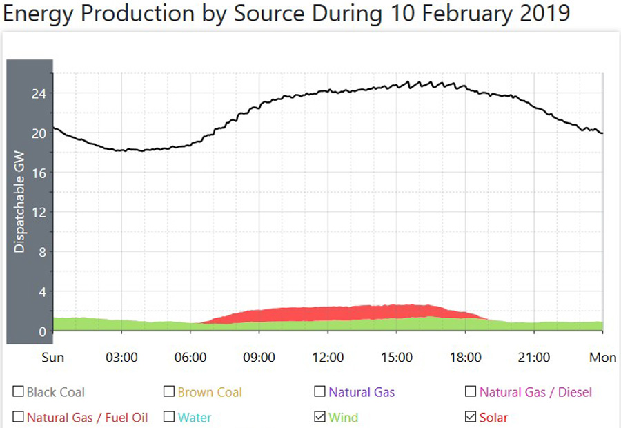
All Renewable Power Generation (Does not include rooftop solar generation)
 This image is the same as for the one directly above for all renewable power, only with the total from all sources removed from the graph. As the scale of the left hand vertical axis has now changed, you can better see the detail of all renewable power. Again, the blue colour is for hydro, the green colour is for wind, and the red colour is for solar. The other colours you can just make out indicates smaller plants, mostly using biofuels as their fuel source, tiny plants adding up to a very small total and for a short time duration. For this data, I have added the times for the daily minimum, and the daily maximum, to show how they do not correlate with the actual times of minimum power consumption (4AM) and maximum power consumption. (around 6/6.30PM)
Daily Minimum – 1300MW
Daily Peak – 3500MW
Average Renewable Generation – 2350MW
Total Generated Power – 56.4GWH
Average Percentage Of Total – 11.29%
Generation From Other Sources
 This image shows the power being generated from the smaller sources other than the major sources of power generation. These include Natural Gas/Diesel, Natural gas/Fuel Oil, Coal Seam Methane, Diesel, Kerosene, Waste Coal Mine Gas and Bagasse. All of these are fossil Fuels, excepting Bagasse which is sugar cane waste mostly used to provide main and auxilliary power at sugar mills.
Note the scale change here, as these are smaller producers of power, and the scale is changed so they can be more easily shown on the graph.
For the data here, I have just added the average generation across the day, the total generated power from all these sources, and the percentage of the total.
Average Generation – 320MW
Total Generated Power – 7.68GWH
Average Percentage Of Total – 1.54%
Hydro Power Generation
 This image shows all Hydro power generation. It is the same as the blue colour in the top image for power generation from all sources.
Again, note here that the shape of this load curve follows the shape of the main load curve for all power generation, in that it has similar peaks in the morning and for the main evening Peak. The coloured lines at the bottom of this graph indicate the power generation from each of the hydro plants in this coverage area.
Daily Minimum – 450MW
Daily Peak – 1710MW
Average Hydro Generation – 770MW
Total Generated Power – 18.48GWH
Average Percentage Of Total – 3.70%
Wind Power Generation
 This image shows the total power generated by every wind plant in this vast coverage area. It is the same as for the green coloured line in the image at the top showing generation from all sources.
The total Nameplate for all these wind plants is 5661MW.
Note that the shape of this load curve does not follow the shape of the main load curve for total power generation. Wind power generates its power only when the wind is blowing, hence it does not follow actual power consumption levels.
For this data, I have added the times for the daily minimum, and the daily maximum, to show how they do not correlate with the actual times of minimum power consumption (4AM) and maximum power consumption. (around 6/6.30PM in Winter and earlier during the Summer Months.)
Daily Minimum – 650MW (7.35AM)
Daily Peak – 1420MW (4.20PM)
Average Wind Generation – 1020MW
Total Generated Power – 24.48GWH
Average Percentage Of Total – 4.90%
Solar Power Plant Generation
 This image shows the total power generated from all the solar power plants in this coverage area. This is the same as for the red coloured area you can just see in that top image.
The total Nameplate for all these 29 solar plants is 2241MW.
Daily Minimum – Zero
Daily Peak – 1420MW
Average Solar Plant Generation for hours of generation – 1000MW (6.00AM till 7.30PM)
Average Solar Plant Generation across the whole 24 hour day – 560MW
Total Generated Power – 13.44GWH
Average Percentage Of Total across the whole 24 hour day – 2.69%
Rooftop Solar Power Generation
 As this source of power generation is classed as ‘behind the meter’, it is not included in the total power generation. Note here that the State of Queensland (QLD on the legend under the graph) is broken down into four separate areas as this is the largest State with the largest number of installations.
While the total Nameplate changes often, the latest information is that the total is now 8000MW and higher, and that is a large total. However, that total equates to almost 2 Million homes with panels on their roof. That equates to an average sized installation of 4.3KW. Most of the power is consumed by the homes with the panels, and what is fed back to the grid is only consumed in the local residential areas. While seemingly still high this total is spread across that huge number of installations across the whole of this coverage area.
Daily Minimum – Zero
Daily Peak – 4420MW
Average For Hours of Generation – 2280MW (5.30AM till 8.00PM)
Average Rooftop Solar Generation across the whole 24 hour day – 1380MW
Total Generated Power – 33.12GWH
Average Percentage Of Total across the whole 24 hour day – 6.63%
Wind And Solar Power Generation Versus Total Power Generation
 This image shows the total power generated from all the wind plants, and all the solar power plants in this coverage area, combined in the one image, and compares it to the overall total generated power, the black line at the top of the graph, which also includes RTS as well. Wind power is the green coloured area, and solar plant power is the red coloured area, and these are the same as shown in those other coloured images at the top of the Post.
I have also added the data below for the total generated power for both wind and solar plant power combined, and the percentage of the overall total below for the maximum power from both sources with respect to the overall total, both at the maximum for both, and then for the total for both at the daily peak Power time.
Daily Peak for Wind and Solar Plant Power – 2700MW
Average Across the whole day – 1580MW
Total Generated Power – 37.92GWH
Average Percentage of Total across the whole 24 hour day – 7.59%
Total Generated power at the daily maximum for both wind and solar plant power, the time of that maximum, and percentage of the total at that daily maximum – 2700MW – 3.40PM – 12.56%
Total Generated power for wind and solar plant power at Peak Power Consumption time for the day, and percentage of total at that daily Peak Power time – 1900MW – 5.55PM – 7.92%
Overall Total With Rooftop Solar Power Added
 This image shows the overall total generated power with Rooftop Solar Power (RTS) added to the total from all of the power plants. RTS is shown here as that orange colour added near the top of the graph in the middle, during daylight hours, and is indicated on the legend below the graph as Rooftop PV (PhotoVoltaics). The new overall total is that black line along the top of the Load Curve. Note here that with this RTS total added, the shape of the full load curve, the black line now looks almost exactly as Summer load curves used to look prior to the advent of RTS, and all those panels on roofs of private dwellings.
Notes
- Finding Averages – On each (non solar) graph, there are 25 hourly time points, starting with midnight and finishing with midnight. I have added the total at each time point together, and divided by 25.
- For both solar power averages, I have used the same addition of hourly time points and then divided by the same number of those time points of actual generation. Every so often, as the days get longer (or shorter after Summer) I change the hours of generation as those hours change.
- For total power in GWH, multiply the average daily power by 24, and then divide by 1000.
- The total percentages for coal fired power, natural gas fired power, all renewables, and those other smaller sources add up to 100%.
- The total percentages for Hydro, Wind, and Solar adds up to the total percentage for all Renewables.
- Total Generated Power is expressed here as GWH (GigaWattHours) and a GWH is a MWH (MegaWattHour) multiplied by 1000
Comments For This Day
As usual, power consumption on this Sunday was the lowest of the week, and overall power generation fell to match that. On top of yesterday’s 8.4% fall, it dropped a further 5.5% today. The average for total generation from every source fell by 1200MW to an hourly average of 20800MW. While indicative of weekend power generation, compared to the highest day of power generation for the week, the Thursday, it was lower on this Sunday by 4500MW, a drop on this day compared to that one of 17.8%, a substantial fall. On this Sunday, as is always usual, the minimum power generation (the Base Load) was lower, and the evening peak was also lower.
While the overall fell by such a large amount, every source but one (wind power) was higher on this day.
The average for coal fired power rose by 370MW to an hourly average of 16610MW. No Units went off line, or came back on line on this day, so there are still 5 of those coal fired Units off line.
The average for natural gas fired power was higher by 120MW. The average for those smaller Other sources was higher by 20MW. The average for hydro power was higher by 90MW, and hey, on the day of lowest power generation for the week, solar plant power has its best day for ages, up by a whopping 120MW to an hourly average of 560MW, but tempered by the fact that even at that high level of power generation, it was still only delivering 2.7% of what was required on the day.
As I mentioned above, wind power had a poor day, well, a shocker really, way down from the high of yesterday, down to an average of 1020MW, a drop on the day of 1920MW, so you can see, that even when the overall fell by such a large amount, 1200MW, they still needed to make up 700MW from the other sources on the day. that average of 1020MW gave wind power a daily operational Capacity factor of 18.02%, well down not just on yesterday, but well lower than the year round average.
With the overall so much lower and coal fired power higher on the day, you can plainly see that coal fired power delivered just under 80% of all the required power on the day.
*****
WEEKLY DATA For Week Nineteen.
Notes For Weekly and Rolling Totals
- Here, the Overall is 100%, so Coal + Natural Gas (NG) + Other + Renewable adds up to that 100%
- Hydro, Wind and Solar add up to the total for Renewable.
- For the first Rolling Total, Rooftop Solar Power (which is behind the meter) is a percentage of the overall total and on top of that total.
- For the second Rolling Total, Rooftop Solar Power is added to the total overall power generation, and new percentages are calculated from that new overall total.
- Total Generated Power is expressed here as GWH (GigaWattHours) and a GWH is a MWH (MegaWattHour) multiplied by 1000.
WEEKLY TOTALS (In GWH)
Week Total Coal NG Other Renew Hydro Wind Solar Rooftop Solar
19 3979.2 2917.92 418.8 66.96 575.52 173.04 336.48 66 200.88
Percent of total 73.33% 10.52% 1.68% 14.47% 4.35% 8.46% 1.66% 5.04%.
COMMENTS for this week.
That total power generation you see there of 3979.2GWH, (just under 4TWH) was lower this week than last week, however, only by 4.2%, which is still a pretty substantial amount.
The highest minimum power generation for the week (the Base Load) was on Tuesday, when it was 19900MW and the highest maximum power generation (the Peak) of the week was on the Wednesday when it was 29900MW. The day of the highest average power generation for the week was on Thursday, when it was 25300MW and the lowest for the week was, as is always the case, the Sunday, when it was 20800MW.
That total for coal fired power (just under 3TWH) was higher this week than last week, so the proportional percentage of the total for coal fired power rose by 3.3% on the week. For this week, there were between two and five Units off line at any one time, so coal fired power, as is nearly always the case is pulling most of the weight when it comes to power delivery for the whole Nation in the Summer Months.
That total for natural gas fired power was well lower this week than last week, so its proportional of the overall was down by almost 2%.
The power delivered by those smaller Other sources was also lower this week as well.
The total for renewable power was an interesting one to look at this week, because it was down by half a percent, despite wind power being so high. That was because hydro power was so much lower, down 2.5% on last week.
Both versions of solar power were also lower on the week, despite being the best time of the year for their power generation, showing that even at the best of times, they are hampered by forces outside of their control, clouds!
As I mentioned, wind had a really good week, the best one for five weeks in fact, and its proportion of the overall was higher by 1.75%. That total power delivered from wind power, 336.48GWH gave wind power a weekly operational Capacity Factor of 35.36% and that’s well higher than the year round average of 30%.
With the overall total from every source falling, and coal fired power rising, its’ obvious that coal fired power delivered a higher percentage of the total this week, and that was 73.33%, proving again, that when REAL power is required to run a Country, it can only come from that one source here in Australia, and that’s coal fired power.
*****
ROLLING TOTALS After Week Nineteen (In GWH) (Just power generation from power plants with rooftop solar behind the meter)
For these totals, Coal + NG + Other + Renewable = 100%. Hydro + Wind + Solar = Renewable Percentage
Week Total Coal NG Other Renew Hydro Wind Solar Rooftop Solar
19 71563.2 53030.4 5761.68 1534.08 11237.04 4846.8 5087.76 1302.48 3843.48
Percent of total 74.11% 8.05% 2.14% 15.70% 6.77% 7.11% 1.82% 5.37%
ROLLING TOTALS After Week Nineteen (In GWH) (With rooftop solar added to the renewable total, and the overall total, and new percentages calculated from that new overall total)
For these totals, Coal + NG + Other + Renewable = 100%. Hydro + Wind + Solar + Rooftop Solar = Renewable Percentage
Week Total Coal NG Other Renew Hydro Wind Solar Rooftop Solar
19 75406.68 53030.4 5761.68 1534.08 15080.52 4846.8 5087.76 1302.48 3843.48
Percent of total 70.33% 7.64% 2.03% 20.00% 6.43% 6.75% 1.72% 5.10%
COMMENTS for this week.
The totals have settled down now so that any changes are only minor in nature, and that was the case this week.
That first Rolling Total, which is the power generated by power plants is on target for around 210TWH of power generated in a year.
Other than for a couple of sources, those percentages of the total are only changing by the tiniest amounts now, barely in the hundredths of a percent.
The only one which did change significantly was natural gas fired power, and even though the total power generated by natural gas fired plants was well down this last wee, that total was still well above the rolling average, so the percentage for natural gas fired power was higher by half a percent, pretty large considering we are at week 19, and all other sources are only changing by hundredths of a percent.
Despite wind power having a good week, its percentage of the total from every source only rose by 0.2%. That total power delivered from wind power of 5087.76GWH gives wind power an operational Capacity Factor after 19 weeks of 28.16%, a slight rise over last week, but still just under the year round average of 30%.
Note the total for all the renewables here, now right on 20%. However, take away hydro power, and the total from just those three sources of renewable most in favour, wind power and both versions of solar power still only come in at 13.5%. An important point to make here is that while that total is 13.5%, it has come at an enormous cost, measured in the hundreds of billions of dollars, and it still only manages 13.5%. Now, extrapolate that out to the promise from most State Governments that they plan to have 50% renewables by 2030, then with 13.5% now, they have to multiply the current existing total by a facot of 3.5 to reach that target, and if it has already cost hundreds of billions of dollars, then you can guess at the end total outlay in dollar terms.
Coal fired power, even with the addition of rooftop solar power on that second Rolling Average is still at 70% of every watt of power being consumed in Australia.
Anton Lang uses the screen name of TonyfromOz, and he writes at this site, PA Pundits International on topics related to electrical power generation, from all sources, concentrating mainly on Renewable Power, and how the two most favoured methods of renewable power generation, Wind Power and all versions of Solar Power, fail comprehensively to deliver levels of power required to replace traditional power generation. His Bio is at this link.
OzPowerGenerationTFO


Posted on Mon 02/11/2019 by TonyfromOz
0