 By Anton Lang ~
This Post details the daily power consumption data for the AEMO coverage area in Australia. For the background information, refer to the Introductory Post at this link.
Each image is shown here at a smaller size to fit on the page alongside the data for that day. If you click on each image, it will open on a new page and at a larger size so you can better see the detail.
Note also the scale change for some of the images. That scale (the total power shown on the left hand axis) has been changed to show the graph at a larger size.
Sunday 23rd December
Total Power Generation All Sources
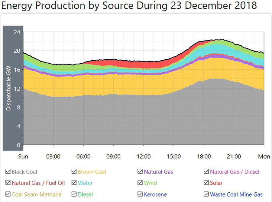 Here, the black line across the top of the graph shows the total power generation from every source. This is also similar to the total power consumption, which is slightly lower after minor grid losses are taken into account.
The dark grey colour is for the black coal fired power generation. The yellowish colour is for the brown coal fired power generation. The purple colour is for natural gas fired power generation. The blue colour is for Hydro (water) power generation. The green colour is for wind power generation. The red colour in the dip between the two peaks is for solar power plant generation. Rooftop solar power is not included on this graph, as this shows just the power generation from all power plants only.
In the data below, both of those (exact) figures for total power consumption for the daily minimum and the daily Peak are taken directly from the AEMO site, adding up the totals for each of the five States in this coverage area. Also, note the slight difference between Total Consumed Power and Total Generated Power. That indicates some of the losses in the grid system
Daily Minimum Power Consumption – MW
Daily Peak Power Consumption – MW
Daily Minimum Generated Power – 16900MW
Daily Maximum Generated Power – 22300MW
Average Total Power Generation – 19200MW
Total Power Generation In GWH – 460.8GWH
All Fossil Fuels Total – Coal Fired and Natural Gas Fired Power Generation
 Here, the upper black line is the total from all fossil fuels, and this is the same as the blue line in the image directly above.
The black line just under that top black line is the Sub Total just for coal fired power. Note here how closely that coal fired line follows the shape of the upper Load Curve, and this indicates that coal fired power can be ramped up and down to follow actual power consumption.
Daily Minimum Coal Fired – 14410MW
Daily Peak Coal Fired – 18530MW
Average Coal Fired Generation – 15860MW
Total Generated Power – 380.64GWH
Average Percentage Of Total – 82.60%
Natural Gas Fired Power Generation
 This image for Natural Gas Fired Power Generation shows the gap between the total for all Fossil Fuelled Sources of power generation and Coal Fired Power Generation in the image directly above.
Note here how closely the shape follows the total power generation Load Curve in the top image, indicating how these natural gas fired plants are used to smooth out the load curve to match actual power consumption.
Note also that while coal fired power provides the bulk of the power, these natural gas fired plants are used to add more power to the system during those time periods during the day when consumption rises for the morning peak, and the main evening Peak
Daily Minimum – 520MW
Daily Peak – 1060MW
Average Natural Gas Fired Generation – 660MW
Total Generated Power – 15.84GWH
Average Percentage Of Total – 3.44%
All Renewable Power Generation Versus Total Power Generation
 This Image shows just the gap between total power generation from every source and the total power from renewable sources only. It is the same image as the first image at the top here, only with the fossil fuelled total (the grey, yellow and purple colours) removed from the graph, As in that top image, it shows Hydro Power, (blue colour) wind power, (green colour) and solar power. (red colour) This image is used here to highlight the gap between the total power generation and the total from renewable sources alone.
All Renewable Power Generation (Does not include rooftop solar generation)
 This image is the same as for the one directly above for all renewable power, only with the total from all sources removed from the graph. As the scale of the left hand vertical axis has now changed, you can better see the detail of all renewable power. Again, the blue colour is for hydro, the green colour is for wind, and the red colour is for solar. The other colours you can just make out indicates smaller plants, mostly using biofuels as their fuel source, tiny plants adding up to a very small total and for a short time duration. For this data, I have added the times for the daily minimum, and the daily maximum, to show how they do not correlate with the actual times of minimum power consumption (4AM) and maximum power consumption. (around 6/6.30PM)
Daily Minimum – 1900MW
Daily Peak – 3200MW
Average Renewable Generation – 2440MW
Total Generated Power – 58.56GWH
Average Percentage Of Total – 12.71%
Generation From Other Sources
 This image shows the power being generated from the seven smaller sources other than the major sources of power generation. These include Natural Gas/Diesel, Natural gas/Fuel Oil, Coal Seam Methane, Diesel, Kerosene, Waste Coal Mine Gas and Bagasse. All of these are fossil Fuels, excepting Bagasse which is sugar cane waste mostly used to provide main and auxilliary power at sugar mills.
Note the scale change here, as these are smaller producers of power, and the scale is changed so they can be more easily shown on the graph.
For the data here, I have just added the average generation across the day, the total generated power from all these sources, and the percentage of the total.
Average Generation – 240MW
Total Generated Power – 5.76GWH
Average Percentage Of Total – 1.25%
Hydro Power Generation
 This image shows all Hydro power generation. It is the same as the orange line in the top image for power generation from all sources.
Again, note here that the shape of this load curve follows the shape of the main load curve for all power generation, in that it has similar peaks in the morning and for the main evening Peak. The coloured lines at the bottom of this graph indicate the power generation from each of the hydro plants in this coverage area.
Daily Minimum – 580MW
Daily Peak – 2020MW
Average Hydro Generation – 1050MW
Total Generated Power – 25.2GWH
Average Percentage Of Total – 5.47%
Wind Power Generation
 This image shows the total power generated by every wind plant in this vast coverage area. It is the same as for the purple coloured line in the image at the top showing generation from all sources.
The total Nameplate for all these wind plants is 5452MW.
Note that the shape of this load curve does not follow the shape of the main load curve for total power generation. Wind power generates its power only when the wind is blowing, hence it does not follow actual power consumption levels.
For this data, I have added the times for the daily minimum, and the daily maximum, to show how they do not correlate with the actual times of minimum power consumption (4AM) and maximum power consumption. (around 6/6.30PM)
Daily Minimum – 280MW (10.25AM)
Daily Peak – 1350MW (5.15AM)
Average Wind Generation – 830MW
Total Generated Power – 19.92GWH
Average Percentage Of Total – 4.32%
Solar Power Plant Generation
 This image shows the total power generated from all the solar power plants in this coverage area. This is the same as for the red coloured area you can just see in that top image.
The total Nameplate for all these 29 solar plants is 2021MW.
Daily Minimum – Zero
Daily Peak – 1470MW
Average Solar Plant Generation for hours of generation – 950MW (5.30AM till 7.30PM)
Average Solar Plant Generation across the whole 24 hour day – 560MW
Total Generated Power – 13.44GWH
Average Percentage Of Total across the whole 24 hour day – 2.92%
Rooftop Solar Power Generation
 As this source of power generation is classed as ‘behind the meter’, it is not included in the total power generation. Note here that the State of Queensland (QLD on the legend under the graph) is broken down into four separate areas as this is the largest State with the largest number of installations.
While the total Nameplate changes often, the latest information is that the total is now 7800MW, and that is a large total. However, that total equates to 1.8 Million homes with panels on their roof. That equates to an average sized installation of 4.3KW. Most of the power is consumed by the homes with the panels, and what is fed back to the grid, while seemingly still high is spread across that huge number of installations across the whole of this coverage area.
Daily Minimum – Zero
Daily Peak – 4490MW
Average For Hours of Generation – 2360MW (5.00AM till 8.00PM)
Average Rooftop Solar Generation across the whole 24 hour day – 1480MW
Total Generated Power – 35.52GWH
Average Percentage Of Total across the whole 24 hour day – 7.71%
Wind And Solar Power Generation Versus Total Power Generation
 This image shows the total power generated from all the wind plants, and all the solar power plants in this coverage area, combined in the one image, and compares it to the overall total generated power, the black line at the top of the graph. Wind power is the green coloured area, and solar plant power is the red coloured area, and these are the same as shown in those other coloured images at the top of the Post.
I have also added the total generated power for both wind and solar plant power combined, and the percentage of the overall total below for the maximum power from both sources with respect to the overall total, both at the maximum for both, and then for the total for both at the daily peak Power time.
Daily Peak for Wind and Solar Plant Power – 2000MW
Average Across the whole day – 1390MW
Total Generated Power – 33.36GWH
Average Percentage of Total across the whole 24 hour day – 7.24%
Total Generated power at the daily maximum for both wind and solar plant power, the time of that maximum, and percentage of the total at that daily maximum – 2000MW – 7.50AM – 11.11%
Total Generated power for wind and solar plant power at Peak Power Consumption time for the day, and percentage of total at that daily Peak Power time – 800MW – 7.30PM – 3.58%
Notes
- Finding Averages – On each (non solar) graph, there are 25 hourly time points, starting with midnight and finishing with midnight. I have added the total at each time point together, and divided by 25.
- For both solar power averages, I have used the same addition of hourly time points and then divided by the same number of those time points of actual generation. Every so often, as the days get longer (or shorter after Summer) I change the hours of generation as those hours change.
- For total power in GWH, multiply the average daily power by 24, and then divide by 1000.
- The total percentages for coal fired power, natural gas fired power, all renewables, and those other smaller sources add up to 100%.
- The total percentages for Hydro, Wind, and Solar adds up to the total percentage for all Renewables.
- Total Generated Power is expressed here as GWH (GigaWattHours) and a GWH is a MWH (MegaWattHour) multiplied by 1000
Comments For This Day
This Sunday, the day of the week which has the lowest power consumption, today was no different and overall power generation was lower by 800MW to an hourly average of only 19200MW, a full 800MW lower than yesterday’s low, and expressed in percentage terms, that’s 4% lower than yesterday, However, when compared with the highest consumption day of the week, this total today was 20% lower than that, and that’s pretty sizeable fall.
The average for coal fired power was lower by 180MW. Unit 4 at the Eraring plant came back on line at midnight, and was slowly stepped up to maximum by 3PM. Unit One at the ancient Liddell plant must have had some sort of problem or other, as it went off line at 9AM, dropping back to zero almost immediately. It came back on line at 5PM, and it too was back delivering its full power by 9PM. In Queensland Unit 4 at the old Gladstone plant went off line at Midnight, a scheduled stoppage as it slowly eased back to zero over a couple of hours. There are still five of those coal fired Units off line.
The only power source to rise was solar plant power, up by 20MW, and as soalr power was higher, then so also was rooftop solar power as well.
The averages for all other power generation sources were lower on the day, natural gas lower by 30MW, those smaller Other sources lower by 60MW, and hydro power lower by 90MW.
The average for wind power was lower by 460MW, way down to only 830MW average per hour and a low of only 280MW. That average for the day gave wind power a daily operational capacity Factor of 15.2%
Note that the combined total for those two renewables of choice, wind power and solar power at the Peak power time of the day only totalled out at delivering 3.58% of the power required to run the Country.
Note that on a day when overall power consumption for the day was so much lower, coal fired power delivered higher than 82% of every watt of power needed to keep the Country running.
*****
WEEKLY DATA For Week Twelve.
Notes For Weekly and Rolling Totals
- Here, the Overall is 100%, so Coal + Natural Gas (NG) + Other + Renewable adds up to that 100%
- Hydro, Wind and Solar add up to the total for Renewable.
- For the first Rolling Total, Rooftop Solar Power (which is behind the meter) is a percentage of the overall total and on top of that total.
- For the second Rolling Total, Rooftop Solar Power is added to the total overall power generation, and new percentages are calculated from that new overall total.
- Total Generated Power is expressed here as GWH (GigaWattHours) and a GWH is a MWH (MegaWattHour) multiplied by 1000.
WEEKLY TOTALS (In GWH)
Week Total Coal NG Other Renew Hydro Wind Solar Rooftop Solar
12 3746.4 2822.16 258.24 73.2 592.8 267.84 241.92 83.04 206.64
Percent of total 75.33% 6.89% 1.95% 15.83% 7.15% 6.46% 2.22% 5.52%
COMMENTS for this week.
Total power generation was slightly lower for this week. However, the total power generated by coal fired sources was almost 2% higher.
While the total power generated from Renewables was slightly lower, both versions of solar power were higher than they were last week, but thar was offset by lower totals for hydro and wind power. Tptal power generated by natural gas and those smaller other sources were also slightly lower.
That total power delivered across the week from wind power gave wind a weekly operational Capacity Factor of 26.4%, a little lower than the yearly average of 30%. Again, wind power had a couple of good days offset by days when it was considerably lower.
That weekly total for coal fired power saw its percentage of power delivered from coal fired sources rise slightly to above three quarters of all generated power for the week.
*****
ROLLING TOTALS After Week Twelve (In GWH) (Just power generation from power plants with rooftop solar behind the meter)
For these totals, Coal + NG + Other + Renewable = 100%. Hydro + Wind + Solar = Renewable Percentage
Week Total Coal NG Other Renew Hydro Wind Solar Rooftop Solar
12 43442.4 32411.04 2993.04 867.12 7171.2 3143.28 3249.36 778.56 2287.2
Percent of total 74.61% 6.89% 1.99% 16.51% 7.24% 7.48% 1.79% 5.26%
ROLLING TOTALS After Week Twelve (In GWH) (With rooftop solar added to the renewable total, and the overall total, and new percentages calculated from that new overall total)
For these totals, Coal + NG + Other + Renewable = 100%. Hydro + Wind + Solar + Rooftop Solar = Renewable Percentage
Week Total Coal NG Other Renew Hydro Wind Solar Rooftop Solar
12 45729.6 32411.04 2993.04 867.12 9458.4 3143.28 3249.36 778.56 2287.2
Percent of total 70.88% 6.54% 1.90% 20.68% 6.87% 7.11% 1.70% 5.00%
COMMENTS for this week.
The only major change this week was coal fired power was slightly higher, and in fact of those seven sources with data collected across the week, four of then saw no change in their percentage at all.
While both versions of solar power were higher as the mid Summer approaches when solar is at its peak insolation and with longer hours of generation, that total for renewables was lower, mainly due to falls in both hydro and wind power. As you can see, take hydro away from that renewables mix and those two versions of solar and wind still only manage less than 14%.
As coal fired power was higher for the week, both Rolling Totals showed an increased percentage for coal fired power generation, and with rooftop solar power added to the total, coal fired power was almost back to 71% of all power being generated.
Anton Lang uses the screen name of TonyfromOz, and he writes at this site, PA Pundits International on topics related to electrical power generation, from all sources, concentrating mainly on Renewable Power, and how the two most favoured methods of renewable power generation, Wind Power and all versions of Solar Power, fail comprehensively to deliver levels of power required to replace traditional power generation. His Bio is at this link.
OzPowerGenerationTFO


Posted on Thu 12/27/2018 by TonyfromOz
0