 By Anton Lang ~
This Post details the daily power consumption data for the AEMO coverage area in Australia. For the background information, refer to the Introductory Post at this link.
Each image is shown here at a smaller size to fit on the page alongside the data for that day. If you click on each image, it will open on a new page and at a larger size so you can better see the detail.
Note also the scale change for some of the images. That scale (the total power shown on the left hand axis) has been changed to show the graph at a larger size.
Tuesday 2nd October 2018
Total Power Generation All Sources
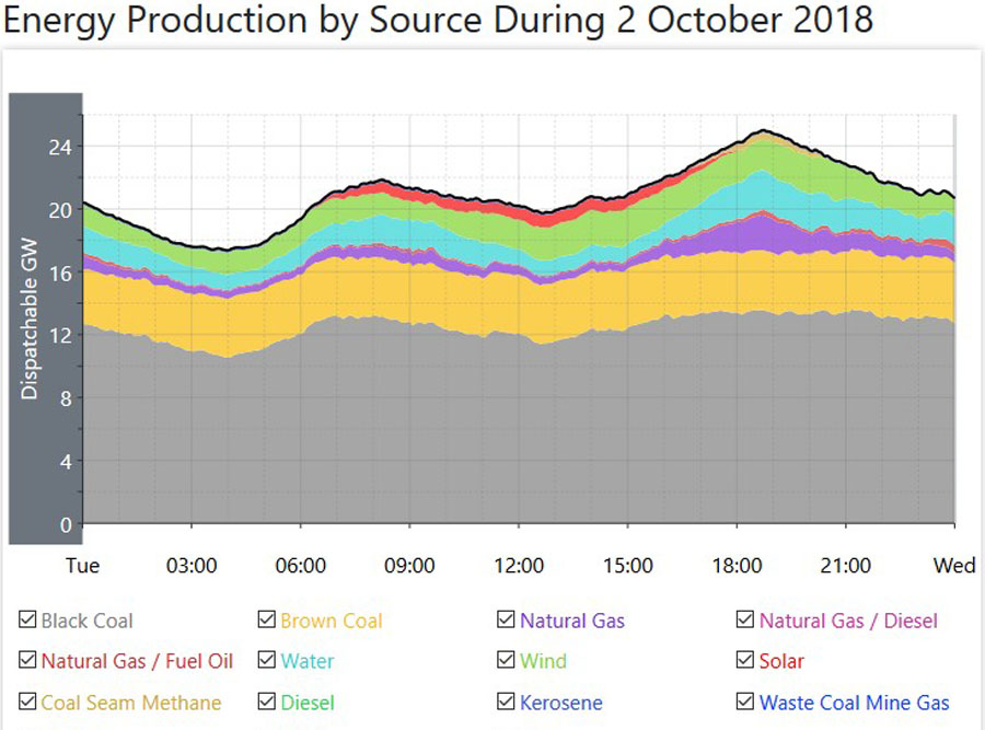 Here, the black line across the top of the graph shows the total power generation from every source. This is also similar to the total power consumption, which is slightly lower after minor grid losses are taken into account.
The dark grey colour is for the black coal fired power generation. The yellowish colour is for the brown coal fired power generation. The purple colour is for natural gas fired power generation. The blue colour is for Hydro (water) power generation. The green colour is for wind power generation. The red colour in the dip between the two peaks is for solar power plant generation. Rooftop solar power is not included on this graph, as this shows just the power generation from all power plants only.
In the data below, both of those (exact) figures for total power consumption for the daily minimum and the daily Peak are taken directly from the AEMO site, adding up the totals for each of the five States in this coverage area. Also, note the slight difference between Total Consumed Power and Total Generated Power. That indicates some of the losses in the grid system
Daily Minimum Power Consumption – 17200MW
Daily Peak Power Consumption – 24400MW (6.30PM)
Daily Minimum Generated Power – 17400MW
Daily Maximum Generated Power – 25000MW
Average Total Power Generation – 21000MW
Total Power Generation In GWH – 504GWH
All Fossil Fuels Total – Coal Fired and Natural Gas Fired Power Generation
 Here, the upper black line is the total from all fossil fuels, and this is the same as the blue line in the image directly above.
The black line just under that top black line is the Sub Total just for coal fired power. Note here how closely that coal fired line follows the shape of the upper Load Curve, and this indicates that coal fired power can be ramped up and down to follow actual power consumption.
Daily Minimum Coal Fired – 14300MW
Daily Peak Coal Fired – 17400MW
Average Coal Fired Generation – 16190MW
Total Generated Power – 388.56GWH
Average Percentage Of Total – 77.1%
Natural Gas Fired Power Generation
 This image for Natural Gas Fired Power Generation shows the gap between the total for all Fossil Fuelled Sources of power generation and Coal Fired Power Generation in the image directly above.
Note here how closely the shape follows the total power generation Load Curve in the top image, indicating how these natural gas fired plants are used to smooth out the load curve to match actual power consumption.
Note also that while coal fired power provides the bulk of the power, these natural gas fired plants are used to add more power to the system during those time periods during the day when consumption rises for the morning peak, and the main evening Peak
Daily Minimum – 600MW
Daily Peak – 3130MW
Average Natural Gas Fired Generation – 1080MW
Total Generated Power – 25.92GWH
Average Percentage Of Total – 5.14%
All Renewable Power Generation Versus Total Power Generation
 This Image shows just the gap between total power generation from every source and the total power from renewable sources only. It is the same image as the first image at the top here, only with the fossil fuelled total (the grey, yellow and purple colours) removed from the graph, As in that top image, it shows Hydro Power, (blue colour) wind power, (green colour) and solar power. (red colour) This image is used here to highlight the gap between the total power generation and the total from renewable sources alone.
All Renewable Power Generation (Does not include rooftop solar generation)
 This image is the same as for the one directly above for all renewable power, only with the total from all sources removed from the graph. As the scale of the left hand vertical axis has now changed, you can better see the detail of all renewable power. Again, the blue colour is for hydro, the green colour is for wind, and the red colour is for solar. The other colours you can just make out indicates smaller plants, mostly using biofuels as their fuel source, tiny plants adding up to a very small total and for a short time duration. For this data, I have added the times for the daily minimum, and the daily maximum, to show how they do not correlate with the actual times of minimum power consumption (4AM) and maximum power consumption. (around 6/6.30PM)
Daily Minimum – 2200MW
Daily Peak – 4700MW
Average Renewable Generation – 3390MW
Total Generated Power – 81.36GWH
Average Percentage Of Total – 16.14%
Generation From Other Sources
 This image shows the power being generated from the seven smaller sources other than the major sources of power generation. These include Natural Gas/Diesel, Natural gas/Fuel Oil, Coal Seam Methane, Diesel, Kerosene, Waste Coal Mine Gas and Bagasse. All of these are fossil Fuels, excepting Bagasse which is sugar cane waste mostly used to provide main and auxilliary power at sugar mills.
Note the scale change here, as these are smaller producers of power, and the scale is changed so they can be more easily shown on the graph.
For the data here, I have just added the average generation across the day, the total generated power from all these sources, and the percentage of the total.
Average Generation – 340MW
Total Generated Power – 8.16GWH
Average Percentage Of Total – 1.62%
Hydro Power Generation
 This image shows all Hydro power generation. It is the same as the orange line in the top image for power generation from all sources.
Again, note here that the shape of this load curve follows the shape of the main load curve for all power generation, in that it has similar peaks in the morning and for the man evening Peak. The coloured lines at the bottom of this graph indicate the power generation from each of the hydro plants in this coverage area.
Daily Minimum – 900MW
Daily Peak – 2570MW
Average Hydro Generation – 1500MW
Total Generated Power – 36GWH
Average Percentage Of Total – 7.14%
Wind Power Generation
 This image shows the total power generated by every wind plant in this vast coverage area. It is the same as for the purple coloured line in the image at the top showing generation from all sources.
The total Nameplate for all these wind plants is 5301MW.
Note that the shape of this load curve does not follow the shape of the main load curve for total power generation. Wind power generates its power only when the wind is blowing, hence it does not follow actual power consumption levels.
For this data, I have added the times for the daily minimum, and the daily maximum, to show how they do not correlate with the actual times of minimum power consumption (4AM) and maximum power consumption. (around 6/6.30PM)
Daily Minimum – 930MW (2AM)
Daily Peak – 2450MW (8.40PM)
Average Wind Generation – 1630MW
Total Generated Power – 39.12GWH
Average Percentage Of Total – 7.76%
Solar Power Plant Generation
 This image shows the total power generated from all the solar power plants in this coverage area. This is the same as for the red coloured line you can just see in that top image.
The total Nameplate for all these 25 solar plants is 1594MW.
Daily Minimum – Zero
Daily Peak – 840MW
Average Solar Plant Generation for hours of generation – 510MW (6.00AM till 6.30PM)
Average Solar Plant Generation across the whole 24 hour day – 260MW
Total Generated Power – 6.24GWH
Average Percentage Of Total across the whole 24 hour day– 1.24%
Rooftop Solar Power Generation
 As this source of power generation is classed as ‘behind the meter’, it is not included in the total power generation. Note here that the State of Queensland (QLD on the legend under the graph) is broken down into four separate areas as this is the largest State with the largest number of installations.
While the total Nameplate changes often, the latest information is that the total is now 7800MW, and that is a large total. However, that total equates to 1.8 Million homes with panels on their roof. That equates to an average sized installation of 4.3KW. Most of the power is consumed by the homes with the panels, and what is fed back to the grid, while seemingly still high is spread across that huge number of installations across the whole of this coverage area.
Daily Minimum – Zero
Daily Peak – 3980MW
Average For Hours of Generation – 2140MW (6.00AM till 6.30PM)
Average Rooftop Solar Generation across the whole 24 hour day – 1100MW
Total Generated Power – 26.4GWH
Average Percentage Of Total across the whole 24 hour day – 5.23%
Notes
- Finding Averages – On each graph there are 25 hourly time points, starting with midnight and finishing with midnight. I have added the total at each time point together, and divided by 25. For coal fired power, I do this on a State by State basis (for the 3 States with coal fired power) and then add the total for each State together.
- For both solar power averages, I have used the average for a (half) Sine Wave which is 0.637 of the Peak value.
- For total power in GWH, multiply the average daily power by 24, and then divide by 1000.
- The total percentages for coal fired power, natural gas fired power, all renewables, and those other smaller sources add up to 100%.
- The total percentages for Hydro, Wind, and Solar adds up to the total percentage for all Renewables.
- Total Generated Power is expressed here as GWH (GigaWattHours) and a GWH is a MWH (MegaWattHour) multiplied by 1000
Comments For This Day
It’s slowly coming back. Somehow, you get into a rhythm, and the work flows easily, and then you get out of the habit of doing it, and all of a sudden, it takes more time than you thought it would. I’m still taking more time than I did with these Posts, but it’s a lot quicker than it took me yesterday.
I’m still striving for greater accuracy, and that has added a little time to the task, but I’m a lot happier with it now.
Total power consumption was higher than it was yesterday, but only marginally, around two and a half percent higher. Perhaps a fairer comparison would be to compare power consumption with a day in Mid Winter where the average hourly power consumption was around 24000MW, compared to this day when it was 21000MW, and that’s (for this day) 13 percent lower, giving you some insight into how power consumption falls in those benign Months of Spring and Autumn I mention every so often. Because those consumption levels are so much lower, those coal fired plants which make up so much of that consumed power can have some down tine for maintenance so they are in their best condition when the Summer power increases really start to kick in. Consider that the difference between this day and the Mid Winter day of 3000MW is the equivalent of almost six to ten Units, or a greater total than the largest coal fired plant in the Country as a whole. To that end, it’s not really surprising to currently see nine Units off line around those three States still with coal fired power. It’s also interesting to watch how that down time is managed. In Queensland for this day, one of those Units which was down, at the Gladstone plant came back up online during the morning, and as it was coming on line, one of the Units at another Queensland plant Millmerran wound down over a period of four to five hours at around the same time.
Even so, the average hourly power generation from coal fired power rose by a little more than 1000MW across the Country to an average of 16190MW per hour, and coal fired power supplied around the same percentage as it did for the day before, around 77% of the total.
Because overall power consumption is down, that average for Natural Gas fired power is also down, pretty much across the board. Why run expensive gas plants when those cheap coal fired plants can supply as much as they do? It only rises when needed to cover the evening Peak power consumption, now slowly easing out to around 6.30PM each evening.
The average for hydro power was slightly down on the day before, mainly because wind power was slightly up on the day. That average for wind power of 1630MW gave wind power a Capacity factor for the day of 30%, pretty much right on its year round average.
The average for solar power was all but the same for yesterday, still only delivering 1.24% of the power required, and that’s at a Capacity factor of only 16.3%, so all those solar plants still only provide niche levels of power at best, even when they are generating their most power at around Midday.
Note also here that the addition I have made to the data, those seven other sources of minor power generation deliver more power than all those solar plants do, and all but one of those is a fossil fuel.
The total power delivered from all the renewables, still only comes in at around 16%, so despite the horrendously huge amount of money they have thrown at those renewables of choice, wind power and solar power, they still deliver only marginal amounts of power and the total is enhanced when you include the regular supply of hydro power, because for this day, wind power and solar power combined only managed to deliver 9% of the power being consumed across the Country, with coal fired power delivering 8.6 times the total power, and doing it when it is actually needed.
Anton Lang uses the screen name of TonyfromOz, and he writes at this site, PA Pundits International on topics related to electrical power generation, from all sources, concentrating mainly on Renewable Power, and how the two most favoured methods of renewable power generation, Wind Power and all versions of Solar Power, fail comprehensively to deliver levels of power required to replace traditional power generation. His Bio is at this link.
OzPowerGenerationTFO


Posted on Wed 10/03/2018 by TonyfromOz
0