 By Anton Lang ~
This Post details the daily power consumption data for the AEMO coverage area in Australia. For the background information, refer to the Introductory Post at this link.
Each image is shown here at a smaller size to fit on the page alongside the data for that day. If you click on each image, it will open on a new page and at a larger size so you can better see the detail.
Note also the scale change for some of the images. That scale (the total power shown on the left hand axis) has been changed to show the graph at a larger size.
Sunday 22nd July 2018
Total Power Generation All Sources
 Here, the black line is the total power generation from every source. This is also the same as for total power consumption, which is slightly lower after minor grid losses are taken into account.
The Blue line is all fossil fuelled power generation. The orange line is hydro power generation. The purple line is wind power generation, and the red line is for solar power generation.
Both of those (exact) figures for total power consumption for the daily minimum and the daily Peak are taken directly from the AEMO site, adding up the totals for each of the five States in this coverage area.
Note the slight difference between Total Consumed Power and Total Generated Power. That indicates some of the losses in the grid system.
Daily Minimum Power Consumption – 18500MW
Daily Peak Power Consumption – 27550MW
Daily Minimum Generated Power – 19200MW
Daily Maximum Generated Power – 28300MW
Average Total Power Generation – 22800MW
Total Power Generation In GWH – 547.2GWH
All Fossil Fuels Total – Coal Fired and Natural Gas Fired Power Generation
 Here, the upper black line is the total from all fossil fuels, and this is the same as the blue line in the image directly above.
The black line just under that top black line is the Sub Total just for coal fired power. Note here how closely that coal fired line follows the shape of the upper Load Curve, and this indicates that coal fired power can be ramped up and down to follow actual power consumption.
Daily Minimum Coal Fired – 14700MW
Daily Peak Coal Fired – 18000MW
Average Coal Fired Generation – 16500MW
Total Generated Power – 396GWH
Average Percentage Of Total – 72.37%
Natural Gas Fired Power Generation
 This image for Natural Gas Fired Power Generation shows the gap between the total for all Fossil Fuelled Sources of power generation and Coal Fired Power Generation in the image directly above.
Note here how closely the shape follows the total power generation Load Curve in the top image, indicating how these natural gas fired plants are used to smooth out the load curve to match actual power consumption.
Note also that while coal fired power provides the bulk of the power, these natural gas fired plants are used to add more power to the system during those time periods during the day when consumption rises for the morning peak, and the main evening Peak
Daily Minimum – 750MW
Daily Peak – 3750MW
Average Natural Gas Fired Generation – 1350MW
Total Generated Power – 32.4GWH
Average Percentage Of Total – 5.92%
All Renewable Power Generation Versus Total Power Generation
 This Image shows just the gap between total power generation from every source and the total power from renewable sources only. It is the same image as the first image at the top here, only with the fossil fuelled total (the blue line) removed from the graph, As in that top image, it shows Hydro Power, (orange line) wind power, (purple line) and solar power. (red line) What I have then done is added the black line just above those coloured lines and this indicates the Sub Total of power from those three renewable sources only. This is to highlight the gap between the total power generation and the total from renewable sources alone.
All Renewable Power Generation (Does not include rooftop solar generation)
 This image is the same as for the one directly above for all renewable power, only with the total from all sources removed from the graph. As the scale of the left hand vertical axis has now changed, you can better see the detail of all renewable power. Again, the orange line is for hydro, the purple line is for wind, and the red line is for solar, and the black line is the Sub total for all renewable power. The other colour just showing indicates smaller plants, mostly using biofuels as their fuel source, tiny plants adding up to a very small total and for a short time duration.
Daily Minimum – 3800MW
Daily Peak – 6900MW
Average Renewable Generation – 4950MW
Total Generated Power – 118.8GWH
Average Percentage Of Total – 21.71%
Hydro Power Generation
 This image shows all Hydro power generation. It is the same as the orange line in the top image for power generation from all sources.
Again, note here that the shape of this load curve follows the shape of the main load curve for all power generation, in that it has similar peaks in the morning and for the man evening Peak. The coloured lines at the bottom of this graph indicate the power generation from each of the hydro plants in this coverage area.
Daily Minimum – 1500MW
Daily Peak – 4400MW
Average Hydro Generation – 2550MW
Total Generated Power – 61.2GWH
Average Percentage Of Total – 11.18%
Wind Power Generation
 This image shows the total power generated by every wind plant in this vast coverage area. It is the same as for the purple coloured line in the image at the top showing generation from all sources.
The total Nameplate for all these wind plants is just under 5225MW.
Note that the shape of this load curve does not follow the shape of the main load curve for total power generation. Wind power generates its power only when the wind is blowing, hence it does not follow actual power consumption levels.
Daily Minimum – 1850MW
Daily Peak – 2750MW
Average Wind Generation – 2270MW
Total Generated Power – 54.48GWH
Average Percentage Of Total – 9.96%
Solar Power Plant Generation
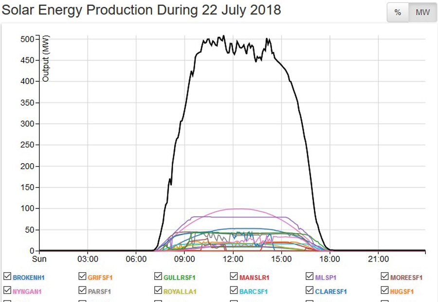 This image shows the total power generated from all the solar power plants in this coverage area. This is the same as for the red coloured line you can just see in that top image.
The total Nameplate for all these 16 solar plants is just lower than 1000MW.
Daily Minimum – Zero
Daily Peak – 500MW
Average Solar Plant Generation for hours of generation – 310MW (7.30AM till 5.30PM)
Average Solar Plant Generation across the whole 24 hour day – 130MW
Total Generated Power – 3.12GWH
Average Percentage Of Total across the whole 24 hour day– 0.57%
Rooftop Solar Power Generation
 As this source of power generation is classed as ‘behind the meter’, it is not included in the total power generation. Note here that the State of Queensland (QLD on the legend under the graph) is broken down into four separate areas as this is the largest State with the largest number of installations.
While the total Nameplate changes often, the latest information is that the total is now 7800MW, and that is a large total. However, that total equates to 1.8 Million homes with panels on their roof. That equates to an average sized installation of 4.3KW. Most of the power is consumed by the homes with the panels, and what is fed back to the grid, while seemingly still high is spread across that huge number of installations across the whole of this coverage area.
Daily Minimum – Zero
Daily Peak – 3400MW
Average For Hours of Generation – 2150MW (7.30AM till 5.30PM)
Average Rooftop Solar Generation across the whole 24 hour day – 900MW
Total Generated Power – 21.6GWH
Average Percentage Of Total across the whole 24 hour day – 3.95%
Notes
- Finding Averages – On each graph there are 9 time points. Add the total at each time point together, and divide by 9. For coal fired power, I do this on a State by State basis (for the 3 States with coal fired power) and then add the total for each State together.
- For both solar power averages, I have used the average for a (half) Sine Wave which is 0.637 of the Peak value.
- For total power in GWH, multiply the average daily power by 24, and then divide by 1000.
- The total percentages for coal fired power, natural gas fired power and all renewables adds up to 100%.
- The total percentages for Hydro, Wind, and Solar adds up to the total percentage for all Renewables.
- Total Generated Power is expressed here as GWH (GigaWattHours) and a GWH is a MWH (MegaWattHour) multiplied by 1000
Comments For This Day
The totals for this Sunday were similar for the Saturday, except for the changes in the overall mix of power generation from the different sources.
The minimum power consumption, that 4AM Base Load figure was 400MW lower, and at the evening peak, it was 170MW higher.
The average for overall power generation from every source was lower on this day by 400MW to an average of 22800MW per hour across the day with a low of just under 19000MW to a high of just under 28000MW.
The average for coal fired power was 300MW, all but covering the overall drop of 400MW. Seven Units are still off line, and the remaining units, while lower on average still delivered over 72% of the total.
As you can see from the natural gas fired power graph, it stayed low during most of the day with just the usual rise to add to the evening power load, and that average for natural gas fired power was 610MW lower, nearly all of that because it was not needed all that much during the morning peak.
The average for hydro power was also lower on the day, by 290MW, again not needed all that much on the weekend days with significantly lower power consumption than for working week days.
The average for wind power was 790MW higher, after that High Pressure weather system moved to the East, and the wind picked up as the isobars between the changing weather systems changed. That average for wind power of 2270MW gave wind power a daily operational Capacity factor of just under 43.5%, higher than normal in a good week for wind power.
So, even on days of lower power consumption and even though coal fired power is lower itself, it is still delivering more than 72% of what is required.
*****
WEEKLY DATA For Week Ten.
Notes For Weekly and Rolling Totals
- Here, the Overall is 100%, so Coal + Natural Gas (NG) + Renewable adds up to that 100%
- Hydro, Wind and Solar add up to the total for Renewable.
- For the first Rolling Total, Rooftop Solar Power (which is behind the meter) is a percentage of the overall total and on top of that total.
- For the second Rolling Total, Rooftop Solar Power is added to the total overall power generation, and new percentages are calculated from that new overall total.
- Total Generated Power is expressed here as GWH (GigaWattHours) and a GWH is a MWH (MegaWattHour) multiplied by 1000.
WEEKLY TOTALS (In GWH)
Week Overall Coal NG Renewable Hydro Wind Solar Rooftop Solar
Week 10 4046.4 2880 275.76 890.64 429.84 441.84 18.96 162.12
Percentage of total 71.17% 6.82% 22.01% 10.62% 10.92% 0.47% 3.7%
COMMENTS for this week.
The overall total for power generation for the week was only slightly lower, but around the average for the Winter Months.
The total for coal fired power was lower, mainly because more of those Units were off line this week. Even so, it was only a little over 4% lower than for last week, and as you can see from the percentage it was still over 71%, while some weeks have seen it as high as 75%.
The total power supplied by natural gas fired power was well down on last week, and the total for hydro power was also lower as well, and both of these were because the total for wind power total was well up on last week. That total for wind power for this week was at an operational Capacity factor for the week of just a little over 50%, well higher than the year round average of 30%. As you can see from these figures, with wind power high, then the total for natural gas fired power is way down, as was (to a slightly lesser degree) the total for hydro power. Because wind power was as high as it was that then slightly increased the total for all renewable power, offset slightly by that fall in hydro power.
The total for Solar power is typical for Winter and as you can see, still only delivering less than half of one percent of the required power.
Rooftop solar power is also similar to what it is for the Winter months, and while so much hype goes into the so called huge amount of rooftop power, it is still only delivering 3.7% of the power required, all of it around that Midday time, and all of it used only by the homes with the panels on their roofs, and nearby homes, as none of that power gets used on the overall grid for the major consumers of electrical power.
*****
ROLLING TOTALS (In GWH) (Just power generation from power plants with rooftop solar behind the meter)
For these totals, Coal + NG + Renewable = 100%. Hydro + Wind + Solar = Renewable Percentage
Week Overall Coal NG Renewable Hydro Wind Solar Rooftop Solar
After Week 10 39573.2 29155.2 3284.16 7133.84 4171.94 2802.86 159.04 1464.18
Percentage of total 73.67% 8.30% 18.03% 10.54% 7.09% 0.40% 3.70%
ROLLING TOTALS (In GWH) (With rooftop solar added to the overall total, and new percentages calculated from that new overall total)
For these totals, Coal + NG + Renewable = 100%. Hydro + Wind + Solar + Rooftop Solar = Renewable Percentage
Week Overall Coal NG Renewable Hydro Wind Solar Rooftop Solar
After Week 10 41037.38 29155.2 3284.16 8598.02 4171.94 2802.86 159.04 1464.18
Percentage of total 71.05% 8.00% 20.95% 10.17% 6.83% 0.39% 3.56%
COMMENTS for this week.
The percentages for the first Rolling Totals list above changed by very little this last week, and are now settling down to how they should stay for the remainder of Winter, and any changes at all are only in that second decimal place, and if high, then only by that first decimal place. As you can see, when it comes to the power generated just from the power plants, coal fired power is still hovering around that 73/74% mark.
The renewable power percentage changed a little higher this week, due to the fact that wind power had such a good week, and even after this good week, you can see that wind power is still only delivering just on 7% of the required power to run the Country. The irony here is that renewables change little, because if wind power is high, then hydro power is lower. That total you see there for wind power gives it an operational Capacity Factor after ten weeks of just over 31%, around the average for the year round total for wind power.
As to the second Rolling Totals list, where I have added rooftop solar power to the renewables total, and to the overall total, it doesn’t alter the percentages by any significant amount.
That total for all renewable power is around 21%, but take that in context with the fact that coal fired power is still delivering more than 3 times the total for every renewable power source in the Country.
Coal fired power, far and away the largest of all suppliers delivers 71% of every watt of power being consumed in Australia.
It, coal fired power, is without fraction of doubt, the single most essential source of power generation in the Country, and there is just no way that will change in the foreseeable future.
Anton Lang uses the screen name of TonyfromOz, and he writes at this site, PA Pundits International on topics related to electrical power generation, from all sources, concentrating mainly on Renewable Power, and how the two most favoured methods of renewable power generation, Wind Power and all versions of Solar Power, fail comprehensively to deliver levels of power required to replace traditional power generation. His Bio is at this link.
OzPowerGenerationTFO


August 3rd, 2018 → 3:31 am
[…] series on daily Australian power supply and demand. The Latest week results, (week 10) and there will be a new one next Monday. Jo Nova […]
LikeLike