Why? Is It Because Of Wind Power?
Well, no!
More correctly, it seems that all those wind towers are just for show. That’s a pretty bold thing to say, and to back it up requires some in depth explanation. What is true is that those Carbon Dioxide (CO2) emissions are down, and in fact 7.5% lower than they were ten years ago, in 2003. CO2 emissions are down because a number of coal fired power plants have closed, which, after all, was the intent, and the simple thing to point at would be the ever increasing number of Wind Power Plants that could be shown to replace those coal fired power plants. However, that is not the case, as the coal fired power plants that have closed have been replaced by plants that use Natural Gas as their fuel, a fuel that when burned still emits CO2, albeit less CO2 per unit of power than for coal fired plants. When the actual power generation data is looked at, that total electrical power once generated by those now closed coal fired plants has been replaced in its totality by Natural Gas fired plants. Not only has it been totally replaced, but now those Natural Gas fired plants are generating more power than those now closed coal fired plants once delivered for consumption, so in effect the replacement has come entirely from Natural Gas and not from Wind Power. The data proves this, and I can explain in detail exactly how.
Where Electrical Power Comes From
Firstly, look at this seemingly simple and innocuous diagram. This isn’t something I’ve just fabricated, but is actual electrical power consumption. This is referred to as a Load Curve. (This image, as well as all others in this Post can be viewed in a separate and larger window by just clicking on the image.)
 This Load Curve is typical of where there is a constant and regular supply of electricity. It looks similar for small towns, large towns, cities, large cities, States, whole electrical grid areas, and in fact, whole Countries, and that’s why there is no indicator for the vertical axis of actual amounts of power, and here I have just left the division lines, and there are 10 of them to make it easier to explain, so each of those divisions on that vertical axis represents 10% of total power generation. The horizontal axis shows time throughout a typical 24 hour period, starting at Midnight and going through the day back to Midnight.
For the purposes of explanation this Load Curve representation above is for the total electrical power in the whole of the U.S.
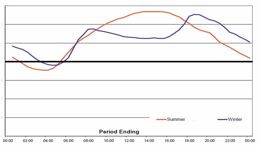
I have added a horizontal line across the graph at the 65% mark of that vertical axis, and then coloured in the three areas above and below that line for ease of explanation. This Load Curve is typical for mid Summer power consumption with the one peak around the middle of the afternoon. At right I have shown an image of two Load Curves, the orange one similar to the large image above, for a Summer situation, and the blue one with the two distinct peaks for a Winter situation. On that blue Winter Curve note the time of those two peaks. There is a sharp rise in consumption early in the morning, starting around 6AM and easing off around 8.30AM, as people rise from sleep, turn on the heating, do breakfast, and all the morning things before leaving the home for work or school. Then note the time for the second peak, starting around 4PM when people arrive home from work and school, turn on the heat and lights, cook their dinner, do their household chores, and watch TV or engage in other home entertainment. That peak lasts longer than the Summer drop off, and slowly eases as people go off to bed.
Now, note the main coloured chart, starting at Midnight. Power drops off to the dip around 3 to 4AM, when mostly everyone is tucked up tight in bed, and asleep. Note specifically the time of the low point of the dip. See how even with nearly everyone sound asleep, the whole Country is still consuming nearly 60% of all the power that is consumed. That is power that is required for 24 hours of every day. EVERY day. 60% of all power. That power comes from large scale coal fired power, nuclear power, and some of it from Hydro power.
So, knowing that, we need power plants that can actually deliver power on that basis, and here’s where the three colours come into play on that image at the top.
The whole of that pink area is supplied from large scale coal fired power, Nuclear power, and some Hydro power. That’s 24 hours of every day, year round. These plants just run at their maximum all the time, delivering their maximum power to the grids. The only time they are not running is when they are undergoing scheduled maintenance, specifically and very carefully worked out so that there is always enough power for all that pink area.
As people rise from sleep, and go about all the things they do, other plants come on line to supply the extra power needed. This is the blue area. In the main, nearly all of this power is provided by Natural gas fired plants. Other plants in this area include some hydro, and other smaller boutique plants as well. Some plants in this blue area only run for around three to four hours a day as extra power is required. These natural gas fired plants are specifically designed for short operational periods of time as this is where they are at their most operationally efficient. Other plants in this blue area are what is termed as Running Reserve, and I’ll explain that a little further down. (Running Reserve can also be referred to as Rolling Reserve, or Spinning Reserve)
So then, how much of all this power being consumed is actually supplied by Wind Power? While seemingly a lot, if you were to believe what you are being told, it only amounts to 3.5% of all power being consumed. That 3.5% indicating ALL the Wind Power contribution is that tiny yellow area at the bottom of the coloured in Load Curve. That’s what that 3.5% comes in at, as it just rolls along the bottom of this diagram.
I could also add in Commercial Solar Power Plants, both Concentrating Solar, and Solar PV plants, and this comes in at 0.13% of that total, or less than a fraction of the thickness of the line indicating the top of the Wind Power total.
Perhaps we could also add on rooftop solar power, so, in that blue area, draw a vertical line down the page at around 8AM and also at 5PM. So, now we have a blue area starting at about 8AM and finishing at around 5PM. This rooftop power supplies some power to the homes that actually have those panels, and some of that generated power is fed back to the grids. That power comes in at around 1% of that blue area, which is about the thickness of the line indicating the top of that Load Curve.
 Look closely at this list showing the size and number of coal fired power plants currently operational in the U.S. Notice the Plants indicated as being over 1000MW. These are the large scale coal fired power plants. Note the number of those plants, 126 in all. These make up only 20% of the number of total plants. However, the power supplied by just those large scale plants comes in at almost 90% of all the power delivered from all those coal fired plants.
Now, when you add together all the power supplied from those large scale coal fired plants, and from all the Nuclear power plants, (those plants that are supplying their power on that 24/7/365 basis) that total power delivered comes in at around 57% of all the power being consumed in the U.S. which fits neatly into that pink area.
What Is Running Reserve?
I mentioned above that some of the power supplied in that blue area comes from plants referred to as Running Reserve. These are the smaller coal fired power plants, and mainly, those are the older power plants, most of them 40 to 50 years old and even older. Note on that list at left all those smaller plants, especially that large number under 250MW in total power, almost half the total number of all coal fired plants. Even though these smaller plants make up almost half the number of coal fired plants in total, the actual power that they supply for consumption comes in at just less than 10% of the total coal fired power contribution.
The operation of any coal fired power plant is such that it operates at its greatest efficiency when it is running either at, or almost at its maximum speed. They cannot be brought on line from a cold start in short time, which is something that Natural Gas fired plants are specifically designed to do. Hence, to actually deliver power from those coal fired plants, at short notice, they must be close to fully operational, in other words have their coal feeding into the furnace, have the water boiled to steam, to drive the turbine, which then drives the generator. So, these plants referred to as Running Reserve are those smaller plants, still operating, still burning coal, still emitting CO2, but not delivering power until they are called on to add a small extra into that blue area. They may only be required to deliver their power for a few hours a day, similar to those Natural Gas fired plants, but because of their nature, not being able to be started cold, then they have to actually be running until called upon, hence Running, and held in Reserve until needed, hence Running Reserve.
I started writing on these and related power subjects more than five years ago now, and some of the early research I did on this exact subject showed that the average age of ALL coal fired power plants in the U.S. was almost 50 years old. Consider here that the average total life span for any coal fired power plant is 50 years, and straight away you realise that there must have been a large number of plants that were older than 50 years old. Such was the case, with between 200 and 250 of those plants actually older than 50 years, some of them more than 90 years old.
Now, in 2013, the average age of all coal fire power plants is down to almost 45 years old, still quite high considering their average 50 year lifespan, but a lot of those older coal fired plants have indeed stopped operation. These are mainly the smaller ones used as Running Reserve, all of them technology from the 1950’s and 60’s, old, and inefficient because of that age factor. What they are (nearly all of them) being replaced by are newer Natural Gas Fired power plants. These are effectively still doing the same task they did as coal fired plants, supplying smaller amounts of power for that blue area on the image, when required to do so. Only now, instead of burning coal and having to run constantly, they can fire up at short notice and supply their power as and when needed. However, using Natural Gas to drive the turbine still means that they emit CO2.
CO2 Emissions Are Falling
For the purposes of all the data I have used here, I am using the comprehensive site, The US. Energy Information Administration site, (EIA) and the reference links are shown at the bottom of this Post.
This replacement of coal fired plants with Natural Gas fired plants is borne out by the data. It’s an easy thing for me to just say that, so lets put some of those figures down here, and first I will deal with those CO2 emissions. Here I will do the comparison between this year, 2013, and for as far back as the data goes, 2003. This effectively gives us a comparison when all of those coal fired plants were in operation, and also a guide as to the ramping up of Wind Power, which has grown almost exponentially in those intervening ten years, ostensibly, as we are told, to replace coal fired power.
For these purposes I have used the standard emissions rates for both coal burning and Natural Gas burning. For coal fired power that is for every ton of coal burned, there are emissions of 2.86 tons of CO2 per ton of coal. For Natural Gas, there are 122 pounds of CO2 emitted for every MCF (thousand cubic feet) of Natural Gas being burned.
2003
Total CO2 emissions from Coal fired power – 2.9 Billion tons of CO2 emitted.
Total CO2 emissions from Natural Gas power – 342 Million tons of CO2 emitted.
Total CO2 emitted from these two sources of the electrical power generating sector – 3.242 Billion tons of CO2 emitted.
2013
Total CO2 emissions from Coal fired power – 2.452 Billion tons of CO2 emitted.
Total CO2 emissions from Natural Gas power – 558 Million tons of CO2 emitted.
Total CO2 emitted from these two sources of electrical power generating sector – 3 Billion tons of CO2 emitted.
So here we see a relatively substantial reduction in CO2 emissions, 242 million tons in all, and when converted to a percentage that comes in at a reduction of 7.5%, which by any count, is indeed a large reduction in CO2 emissions.
However, let’s then do the figures for actual power generation for consumption by electricity users.
2003
Total power supplied from Coal fired power – 1973.737TWH
Total power supplied from Natural Gas fired power – 649.908TWH
Total power supplied from Coal and natural gas – 2623.645TWH
2013
Total power supplied from Coal fired power – 1577.878TWH
Total power supplied from Natural Gas fired power – 1190.967TWH
Total power supplied from Coal and natural gas – 2768.845TWH
So, here we see that the power delivered from coal fired power has dropped, quite dramatically too, 30% in all, proving that coal fired power plants must be closing down in relatively large numbers.
However, what this data proves conclusively is that these plants are being replaced by Natural Gas fired plants, and gas fired power has risen by a huge 83%.
When you look at the overall power consumption from these two power generation sources, that increase comes in at 5.5%, which places the rise into some perspective.
So, here we see that even though those coal fired plants are closing, resulting in a reduction of CO2 emissions, all the power that was once supplied by these old coal fired units has been replaced, not by wind plants, but by Natural Gas fired plants.
Over those same 10 years, Wind Power has ramped up to a point where Wind now has a total Capacity of 62,000MW. This is the equivalent of 31 large scale coal fired plants, and here I’m not talking those over 1000MW, but the equal of 31 plants greater than 2000MW. Now go back to the list of plants I showed above. See that number of coal fired plants greater than 2000MW. There’s 29 of them. Now we have the equivalent of 31 Large scale coal fired plants just with the Capacity of Wind Power. That number of 29 large scale (2000MW) plants has not changed in those 10 years. Not one of them has closed down. In fact, not one coal fired power plant greater than 750MW has closed in those 10 years. So then, so much for the idea that Wind Plants will replace coal fired plants, something they cannot do, as Wind plants only supply their power on a sporadic time basis, when the power supplied from Coal fired power is power that CAN be delivered on a 24/7/365 basis.
In that same 10 years that wind power has ramped up, the amount of power they actually supply to grids has risen from 11TWH to 149TWH, a seemingly large increase of 138TWH.
However, as I have shown here, none of that wind power has replaced coal fired power, as all of that has been replaced by Natural Gas fired power.
Now go right back to the image at the top of the page, and look at that coloured in Load Curve. See that yellow area at the bottom of the image. THAT is what all that Wind Power supplies. 3.5% of all power being consumed. It rolls along the very bottom of that pink coloured area, virtually nothing.
For some further perspective that Wind Power Capacity is nowhere near the same as 31 large scale coal fired power plants, the power that is actually supplied by all that wind power is the same as what is being delivered from only 7 of those large scale (2000MW+) coal fired plants.
Conclusions
In ten years, CO2 emissions have gone down by 7.5%, coal fired plants have indeed closed, albeit old ones, some even ancient, and all of them of small to tiny capacity. All of that power, and more has been replaced, not by wind power, but by Natural Gas fired power, mainly from those coal fired plants doing on site conversions from coal fired to natural gas fired plants.
Now, while those emissions have fallen, do not get sucked into believing that (while the U.S. is not a signatory) the U.S. is achieving what The Kyoto Protocol called for, because that is a reduction in CO2 emissions to a level 7% lower than what they were in 1990. That Kyoto target comes in at a full 20% reduction in those CO2 emissions.
Those coal fired plants that have closed make up a significant number of the total plants, but the single most important thing here is not the number but the power that they actually delivered. While that number of plants is quite high, those closed plants still only see a reduction in less than 10% of the total power delivered from all coal fired power, and as shown here, they have been totally replaced by natural gas fired plants, and in fact replaced by plants delivering more power, so the nett effect when it comes to power for consumption is that this has increased, and it’s also just a case of replacing large CO2 emitters with lesser CO2 emitters.
To actually achieve the intent of The Kyoto Protocol, then that means more plant closures, and not just replacing them with natural gas fired plants. Those extra closures would need to be those large scale coal fired plants, in fact more than one third of them, and when these plants are supplying 90% of coal fired power in total, and 35% of the total US power consumption, than that effectively means a 10% cut in total power delivery for the U.S. which is something that just will not happen, because there is nothing to replace those levels of power with.
One of the most perfect indicators as to that is the fact that there is now 62,000MW of Wind Power, the equivalent of 31 large scale coal fired plants, nearly all of that constructed over the last ten years, and yet, not one large scale coal fired plant has closed. NOT ONE. That should tell anybody that Wind Power will NEVER replace coal fired power.
So, it really does seem that all those tens of thousands of huge wind towers, costing hundreds of Billions of dollars really are ….. just for show.
REFERENCES
Coal Fired Power and Natural Gas Fired Power Generation Totals
Renewable Power Generation Totals
Coal Fired Power Plant Closures If you do take some time to view the large number of coal fired plant closures listed at this link, take notice of the age of those plants that are closing, and quite a large percentage of them are older than 50 years.


Posted on Wed 07/10/2013 by TonyfromOz
0