 By Anton Lang ~
(Each day, the most recent Part in this Series will then be added to the bottom of this Main Post)
As an introduction, sometimes you can wait many Months to see electrical power generation and consumption data. The Australian Government Report comes out yearly, with the data from the previous year, sometimes up to 20 Months from the start of recording data to publishing of the Report. I use three separate sites to locate data, and all of them report in real time, so, having now done this for so many years, I can detail that data almost in real time as well, just one day after the recording of the data. That’s thanks not to me, but the people who provide that data. All I do is copy it down. This data is for the end of the recording Season for Winter (here in Australia) and details all the daily power generation and consumption data for the whole of the year from 1 September 2021 (the start of Spring) to 31 August 2022 (the end of Winter) ….. yesterday. So, while not a calendar year, January to December, or a Financial year July 01 to June 30, this still encompasses the four consecutive Seasons that make a full year, 365 days.
Every image you see in this Post is sized at a smaller size to best fit the page. If you click on any of the images, each one will open on a new page, and at a much larger size so you see the detail better.
So often, when people speak about electrical power, they quote numbers, and use terms that to an ordinary person mean very little, if anything at all. And nearly everything about electrical power generation is closely related to Mathematics, and Maths is almost like a foreign language these days, and that can be seen when you watch some of the TV quiz shows, and when the host asks a question about Maths, nearly everyone either passes, or gets the answer wrong. So, when people talk about electrical power generation, that also is all about engineering that again, most people would not understand. So, even though the data and the facts are correctly stated, it’s in Electrical Engineering ‘speak’, and very few people know what it all means, so it is more readily accepted, and that’s sorta what they would like you to believe. It’s a bit like, look, we know all this ‘stuff’ so you should just believe what we tell you. ….. It’s not wrong, but, hey who would know?
For example look at these two images showing Australian power generation for the last year.


The top image shows the whole page for this data, and the second image is a larger sized image enlargement of the part I want to draw your attention to, and that shows the total power generation for Australia for the last year. To ninety nine out of a hundred people, what is shown in that enlarged image is pretty much a totally meaningless bunch of numbers. Those many vertical coloured lines are the daily power generation for each source, and the coloured boxes to the left in the text area indicate the source, and the colour of that source for those vertical lines, and the first row of numbers is the total power generated by each of those sources for the year.
As I mentioned above, this is for the last year up to the last day of Winter. (Here in Australia, the Seasons change on the first day of every third Month, so the first day of Spring is the 1st September) So, this image shows power generation from every source of electrical power generation across nearly all of Australia, the AEMO coverage area, and this is for all of Australia except the State of Western Australia, and the relatively small jurisdiction (by population) of The Northern Territory. So, this is around 90% of all of Australia’s power generation, and ALL of this huge area is covered by the one power grid.
That total right at the very top of that first row of numbers is the total power generation, and it is also the same as total power consumption (except for some small losses always inherent on this, and any, overall grid system) for this same area, as consumed power must equal generated power. The total power generated at ANY one point in time is the same as what is being consumed.
Okay then, unless you are electrically trained, then, as a layman, looking at those numbers in that image above for the first time, it is difficult at best to understand them ….. and more importantly, what they actually mean.
What if there was a way to show it as, say, a group of different images, using these exact figures, and then explaining what each new image means.
Well, this is what I hope to do here, to explain something that, while looking like a relatively simple ‘bunch’ of numbers is actually quite complex, and requires very careful explanation.
By its very nature, this will be a long Post to do that, so, rather than explain it all in just the one hugely long Post, I’m going to show a different image or two each day or so with its own explanation, and at the end of each daily Post, consolidate them all back into this one long Post, after each day’s Post is added.
Okay then, now I have set the scene, let’s start distilling down those images, and showing the end result with more images, in the following Posts.
Going back to that second image above, I’ll show it again, only this time with some extras I have added to draw your attention to more that I want to show you, because these numbers give me the basis for all further images.

Note the dates, and under that, the circled totals for ALL power generation, the largest number at the top, and under that, the four Renewable sources of power, Rooftop Solar Power, Industrial Solar Power Plants, Wind Plants, and Hydro Electric Plants, as these are the power sources I will be concentrating on in the upcoming Posts.
(From Part 2)
Okay, the first thing to note from this image is the dates at the top I have circled in red. Note that this is from 31August to 31 August. So here we have an extra day, as I mentioned that the year starts from the 1st September.
So, what we need to do is now subtract the figures for that earlier date 31 Aug 2021. From those vertical lines indicating daily power and the sources, those figures for that day are as follows:
Total Power – 557GWh, Solar (Rooftop) – 42GWh, Solar (Utility) – 22GWh, Wind – 90GWh, Hydro – 35GWh.
That leaves us with the new totals for just the 365 days as:
Total Generated Power – 207,531GWH
Solar (Rooftop) – 17640GWh
Solar (Utility) – 10428GWh
Wind – 25216GWh
Hydro – 16558GWh
Again, I mentioned the Electrical terms and how they can sometimes be misunderstood by nearly everyone not specifically trained with an Electrical Engineering background. One of those is the actual definition of what those figures are expressed in, that tern GWH. That stands for GigaWattHours. Electrical engineering uses powers of ten because some numbers are so huge, that to express them without using those powers of ten would mean some pretty huge numbers, and here, as an example that top number, the total power consumed across the whole year is (now) 207,531GWH, and that is 207,531,000,000,000 Watts. The powers of ten are expressed Kilo (1000) Mega (1,000,000) Giga (1,000,000,000) and Terra (1,000,000,000,000) As a person not trained in electrical matters, you would actually still be exposed to them every so often, and that would be with your electricity account you receive from your provider. All of the electrical power usage on those accounts is expressed in KWH. So, using that as an example, you can see the immensity of those figures here for what is basically the whole of Australia.
Okay, so here we now have exact figures for the full year.
From those exact figures we can then find an average of them for just one day. Now look, even I know that nothing is average when it comes to electrical power generation or consumption. The numbers required are absolute, and a twenty four hour day’s power consumption for this vast coverage area varies from a low of 493GWH for the lowest day of the year, to a high of 678GWH for the highest day. However, an average is indicative of what is actually being consumed across the year,, and using those averages, I can then show you an image of what power generation and power consumption looks like.
So, using those exact figures, we now can work out the averages for the total power, and those four Renewable sources I want to concentrate on.
The average for those five indicators are as follows:
Total Generated Power – 568GWH
Solar (Rooftop) – 48GWh
Solar (Utility) – 28GWh
Wind – 69GWh
Hydro – 45GWh
Okay, there you have it.
Again, these are just numbers on the page, so what we could do now is to find an image for what that actually looks like.
Firstly, what we need to do first is to locate that one day across those 365 days of the year when all those indicators are the same as for the actual figures we have worked out from the totals.
365 days to choose from. That should be a fairly easy thing, surely.
In fact, there were only THREE days across the whole year where that total of 568GWH was generated/consumed. And not one of those days had those other four indicators even remotely close to the numbers we have calculated as ….. ‘average’.
So now I had to cast an even wider net to find a day where the figures for that day were as close as they could be to all five of those indicators. I settled on firstly finding a day closest to the overall total, and even using a two percent range, it was still not very easy, and here two percent of that 568GWH gives a range between 556GW and 579GWH, and that’s a pretty wide margin considering that gap is 23GWH, and remembering the powers of ten, that’s 23,000,000,000 Watts, so that’s a pretty humugous range.
Okay, that 2% margin gave me now 21 days across the full 365 day year. And from those 21 days, again, none of them had the other four averages even close.
So, the one day when all indicators were the closest to the averages for all five of them was the 7th September 2021. And now, as I mentioned, this is basically to show you images of what power generation/consumption looks like, here’s the image of that day from the same NEM source of all those earlier images. (Reminder, view the image on the larger page)

Okay, first, I have used an arrow to point to that day on the chart of vertical colours indicating power sources. You can (vaguely) see the orange vertical line, indicating that day is highlighted. The actual date is circled, also in red, at the top right. Under that and circled in black are the five data points we are concentrating on.
Now using the blue coloured circles and the line between them I want to show you a very minor perceived anomaly. Note the black circled total is 562GWH, and yet the average for this day shown in the upper blue circle is 558GWH. The lower blue circle is under the heading of Loads, and the two loads are the minute on of battery charging, and the much larger one of Pumps. Now those pumps are the huge pumps used by Pumped Hydro Units at Tumut Three mainly to pump water back up the Mountain to the upper holding water dam. Now some (green leaning) sites would like to think of this is not to be counted as it is used in the generation of power, you know as if the power is there somehow magically. It actually IS power that is being consumed, and in both cases, battery, and pumps, there are losses associated with both anyway, so it’s a little disingenuous to say that the power is NOT being consumed. So that’s why I use the total I have circled, which in reality is actually what IS being consumed.
The numbers for that day were as follows
Total Generated Power – 562GWH (1.1% lower than the average)
Solar (Rooftop) – 52GWh (8.3% higher than the average)
Solar (Utility) – 30GWh (7.1% higher than the average)
Wind – 64GWh (7.3% lower than the average)
Hydro – 48GWh (6.6% higher than the average)
Now, you might think that those those percentages are not all that close to the average, but trust me on this, they are the closest I could find, understanding that there are FIVE indicators to line up. In actuality, what I have found here is probably better all round for what I want to show you, (eventually) because three of those renewables are higher, and the overall total is lower, so in fact, it makes those renewables look a little better. The total generated power from all four of those renewables for the calculated average day comes in at 190GWH, while the actual day I am using as the closest to average, well, the total for those four renewables comes in at 194GWH, so a percentage factor of just 2.1%, so while the numbers look to be not all that close, the outcome is that they are quite close, well, as close as I can find for 365 days, and you think it would be easier than that, eh!
So now we have an ‘average’ day for power generation/consumption. You’ll remember that earlier I wrote that I use three main sources for my electrical data. So, what I can now do is, using one of those other sites, show you what that average day of power usage looks like, and here’s that image which I will explain in the next Post.

(From Part 3)
What appears to be such an innocuous looking image contains such a wealth of so much information, it will take me four separate Posts to explain it all.
I mentioned earlier that I use three sites for all of my data gathering, and this image above is from the one I use the most, and have been using now for so many years, and that is the Aneroid Energy site at this link.
The third site I use is the AEMO recording site for power generation data, and while I mentioned that I will be attempting to do these explanations with images and then explaining the images, this one site I will refer you to and show just the two images, but this is the only time I will refer to it.

 The image at left shows the informational links at the site, and here’s the link to that site, the NEMWEB Dispatch Reports. Each of those blue links are single reports on the power generation of every Unit at every power plant in the AEMO coverage area. If you look closely at the image, you’ll see the time relationship between reports, and that is a new report every five minutes. That’s why I have only shown a partial image here of the bottom part of the page, because there are 288 reports to the page, and each page covers just a single 24 hour day to a single page, so as the new report is released, the oldest one drops off the top of the page. Each report is shown at the link, one of all of those blue links at the right of the image. You can see that the bottom one is a slightly different colour, because that’s the one I used for the second image, at right of the page. If you click on the link, it will be saved as a Zip File to the Downloads section of your computer. When you then go to the Downloads section of your computer and click on that zip file, you computer unzips it, and saves it as a Spreadsheet file. You then have to open your Spreadsheet, and open the file, and that shows you what I have used here as the second image. Again, it is a very long file, so here I have only shown the bottom of that spreadsheet file as an image.
As you can see there are 416 entries. Each one of those entries is for an individual power plant across the AEMO coverage area. Where individual power plants have more then one Unit, then each Unit has an entry, so as you look here at the last four entries on the page, you’ll see the code in the second last column shown as YWPS1,2,3, and 4, and these are the four Units at the YallournW brown coal fired power plant in Victoria. So here, Unit 4 at that YallournW Plant was delivering 378+MW of power at that recording time. So there are 416 different sources of power generation. Each report shows the power delivered by that Unit or plant in the most recent five minute period, and the SCADA Reports are generated in real time, as it happens, and shown at the site almost immediately.
Both of the other two sites I use take these instantaneous reports, and using their own software, convert that data to the images you see here, the images from the earlier Posts, and the image at the top of this page, and they are also shown in real time, at the same five minute time rate.
*****
Okay then, you should already have that top image open in a new and larger window, so here’s the explanation for that.
This image shows the power generation from all sources across the day I am using for the year round ‘average’ for all power generation, September 7 2021, and that day was a Tuesday, so a good indicative day, as weekend power consumption is way different to normal work and school day weekdays. Each day (naturally) starts at Midnight, and goes across the page to the next Midnight in one hour divisions. Those divisions are shown in this still image I have taken, but at the site, you can hover your mouse over anywhere on the page, and it shows the power again at the recording rate of each and every five minutes.
The black line at the top of the image is the total power for the day. This black line is referred to as the Load Curve. While that is the generated power, I have told you that it is also the same as for the power being consumed as well.
Note that from Midnight, it falls to the overnight low at around 3.30AM to 4AM. Then it rises again, and this is the usual Morning peak, when everyone gets out of bed, tidies up, has breakfast etc, and gets ready for the usual work or school day, and then leaves the home for the day. That morning Peak is usually between 7AM and 8AM, and you can see that where the colours UNDER the yellow one begin to fall again. The yellow colour is rooftop solar power, and as the Sun rises, so the power from those panels increases. The power then falls away in the mid morning and early afternoon, and then begins to rise again towards the usual evening Peak which happens at around 6.15PM to 6.45PM. That’s when everyone gets home from work, and school, and fires up all the power being used in normal everyday life at home, cooking for the evening meals, heating in Winter, and cooling in Summer, all the chores at home which require power, and entertainment as well. That evening Peak is at around the same time, ALL the year round, each and every day, and is the highest point of power consumption during the day.
The shape of that black line is similar to the one you see here for 6 Months of the year, the cooler Months leading into and out of Winter, when that dip in the middle of the day is deepest, and where you will see two distinct Peaks, with that evening one always the highest. In Summer, there is no Midday dip, as power consumption consistently rises to a peak which in Mid Summer can be higher than that usual evening Peak, which is still there, just now hidden by extra power consumption during the middle of the day. That extra power consumption is mostly from what is called HVAC, (Heating Ventilation, and Air Conditioning) and that power is consumed in every single high rise building in the Country as they work hard to keep the inside of those towers cool, and supplied with circulated breathing air. That gap between the mid Winter dip and the mid Summer bulge can be anything up to 5000MW to even 8000MW, a huge added power consumption.
That’s the black line at the top.
Under that are the colours indicating all of the power sources, and each one has a different colour, and each colour corresponds to what is shown in the ‘legend’ under the graph itself. This shows the makeup of power generation across the whole grid, the total power generation mix for that day in question.
As I get further into these Posts, I will be explaining the colours, some of them just in passing, and concentrating on just four of those sources, those four renewable sources of power generation, and their relationship to the overall total power generation and more importantly, their relationship to that other aspect of that same black line, actual power consumption.
However, let’s get one thing out of the way right at the start, and it concerns that black line. See the steps in it, those jagged ups and downs in the mid morning and the late afternoon, after Sunrise and at Sunset. Well, they are due solely to rooftop solar power. I mentioned above that all power is recorded on a five minute basis. That’s easy for the AEMO to do. However, when it comes to Rooftop Solar Power, that is power that the AEMO CANNOT record, because it is connected to individual households roofs, and there is no way that they can record it at all. So what is done here is that they make a best case guess on how much power is being generated by rooftop solar power, and that is noted, but only noted every half hour. So, while power plant power is recorded on that five minute basis, it makes for a smoother graph across the whole 24 hour day, so 288 separate recording of each individual Unit. Rooftop solar power is noted with that half hour guess. So that gives us a graph for rooftop solar power and that is shown on the image at left below, just showing rooftop solar power on its own. One recording, and then the next recording half an hour later, hence the steps as power rises, and then falls back. So,when it is shown at the same scale as the main graph, what you get is the image at right, showing the steps, only a little smaller, and when shown on the total power (black line) you see those jagged ups and downs, the steps of rooftop solar power.

 Okay, with that explanation done, let’s get into it. Firstly, what I would like to show you is just some images of the simplest part of the graph, that solitary black line at the top, and the image below will make up the next Post, and while it is so simple, that back line can show so much. However, what I have added here is a little extra as a lead in.

(From Part 4)
Hmm! Will you look at that. The lowest point that total power consumption gets down to is at 4AM, while nearly all of us are tucked up tight in bed, and sound asleep. And will you just look at how high that power consumption is. That’s 18.8GW or 18,800MW. Consider that for a moment ….. the LOWEST point for the day for power consumption. Now, I’ve been keeping this data for the last, well, for almost six years now, and writing about all things related to electrical power, and the data, for more than fourteen years. The first year of data collection actually concentrated on that low point for the day. Each day I collected the data for minimum power consumption for all States, and from that the overall total for this AEMO grid. For that whole year, that average for that low point came in at 18,050MW, and that was in 2017/18. For years prior to that I always used the figure of 18,000MW for here in Australia, and someone suggested to me that figure was wrong, not only wrong, but in fact monumentally horrendously wrong, and far too high, even though from looking at these Load Curves for so many years, I knew it to be a fact. I was told that was just, well, something I had made up. So, to prove my point, I actually collected the data every day for a year across every State of the Australian grid, and at the end of that year, the figure came in at just under 18,050MW. Not hearsay any more, but fact. (Here’s the link to that Series, every Post, but here, you only need look at the last one, the one on the top to see the totals)
What has happened in the years since then is that the figure is ever so slowly rising. Two years ago it was closer to 18,100MW, and now, late in 2022, it’s closing in on 18,200MW. Again, that’s the LOWEST power consumption for the day. Every other time of the day, it’s higher, so this lowest point it gets down to is the minimum, or the base, and that’s why that low point is referred to as the BASE LOAD.
In the earlier Posts I told you that the average power consumption for an average day was 568GWH, and that translates to an average of 23,666MW, and while power is consumed according to how it is shown on the Load Curve, (that black line) that’s the average power that has to be available every hour across the day to give that total of 568GWH. (23,666 X 24 and Divided by 1000) So, if the average power needed for the day is that figure, then this (current) year round average of 18,200MW constitutes 76.9% of the daily average for overall power consumption. That’s a whopping amount of power being consumed while we all sleep. In Summer and Winter, that figure is higher, and in Autumn and Spring, it is lower. I have seen it as low as 16,500MW (most commonly on Christmas Day) and I have seen it as high as 22,000MW on a freezingly cold Winter morning.
Also here, note again the time, at 4AM, That hardly ever varies, always at or close to that time. Think about that, as that is always before Sunrise, even during Daylight Savings Time, so here, that minimum, the Base Load never has any contribution from either version of solar power, be it from the power plants, or from the panels on top of household roofs around the Country. The ONLY contribution from renewable sources is from wind generation and hydro generation.
Okay, here’s the next image.
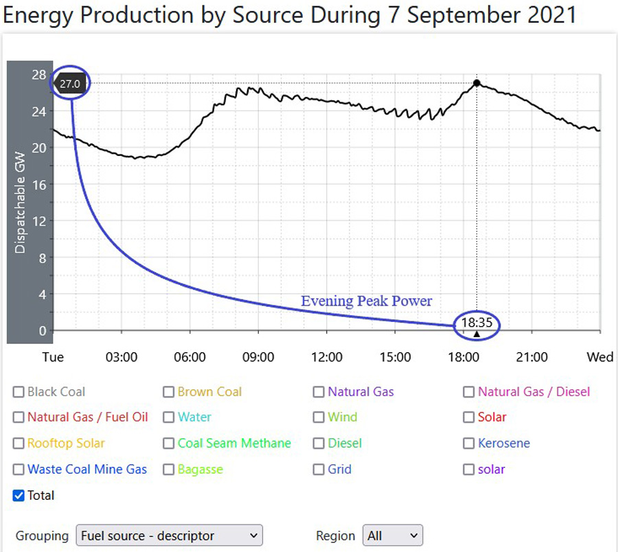
This is for the evening Peak, the highest point of power generation and more importantly power consumption for the day. The time doesn’t vary all that much, sometimes as early as 5PM (pretty rare) and sometimes as late as 7PM, also pretty rare as well. Even in Daylight Savings Time (DST) in Summer, it’s not much different, and the Two major States, and a smaller State have DST, and one large State and a smaller State almost balance that out.
Here, I’m only going to use this figure for this specific day of 27GW, and again, that’s 27,000MW. I have done the Maths, looking at every single day of the year for that Peak, and at the same time, every single day of the year for the contribution from the four Renewables ….. at the same time of day, and I will detail those exact figures in the upcoming Post which details that, but this total shown here is pretty much representative of the end exact number. (again, an average I know, but as I said earlier, it is indicative) Again, while this is the average, then just like the Base Load above, it is higher in Summer and Winter, and lower in Autumn and Spring. The low point is usually around 22,000MW, and you may think, hey, that’s lower than the year round average considering it’s sip[posed to be the high point for every day, But Christmas Day is the one day of the year when power consumption is at its absolute lowest total for the year, even considering it’s virtually a Mid Summer’s day. I have seen the Peak as high as 33,000MW in Summer, and 34,000MW in Winter. Here, let me add that perhaps we can actually be thankful that one of the three largest consuming States does not have DST, because if that State (Queensland) did have DST, then that Peak in the Summer Months would be higher, as now, it spreads out the Peak, perhaps lasting a little longer (by around an hour) but it is not as singularly high at that one point in time as it would be if all States were to have DST, and hey, you can bet that very few people would even realise that at all, let alone understand it.
It’s pretty much obvious why this time is the time of maximum power consumption for the day. You can see on the Load Curve itself that power consumption starts to rise in the mid to late afternoon, as children get home from school, and then the adults get home from work. Everything in the home gets turned on, the washing machine, dryer for the washing, phones get charged, the heat gets turned on in Winter, the aircon in Summer, the TV, music, and around 6PM, on go all the lights. Showers get used, so (some non off peak) water heating comes on, and around 6PM, the evening meal gets cooked. All of this adds up to a huge extra electrical power burden on the grid.
Again, also note the time here, around 6.30PM each and every evening. You know, usually after Sunset, so again we have those two solar renewable sources either not contributing at all, or if it is in Summer, then they are approaching their lowest power generation for the day.
Now here’s where some cynicism comes to the fore, hey, not from me, but from those most virtuous of all entities, the electrical power retailers. In days now long passed, electrical power was charged at the one flat rate, x number of cents per KWH, no matter if no one was home and just the basics were powered up in your home, to that time when you were all at home and consuming the maximum for the day for your home, and that was always at that evening Peak time. The same time of evening that a lifetime of everyone who has ever lived does, the same time everyone gets home from school and work, the same time all the chores get done because we all now work during the day, the same time the evening meal is cooked and eaten, the same time all the lights go on, the same time you all sit and relax in front of the TV ….. the SAME TIME every night of your life.
And that is ALWAYS the time of Peak power consumption, the time when, with power plants, it’s all hands on deck. Now, we have got to the point that, and, unlike in times gone by when there was always plenty of electrical power ‘on tap’, nearly all of it cheap and plentiful coal fired power, we are now at the point where power supply is pretty sparse, coal fired power plants are vilified almost out of existence, and power supply is difficult at best, and because of that, the actual coat of power at and around that evening Peak has actually skyrocketed, almost into the Stratosphere.
So now, those power retailers have to pay an awful lot extra for their wholesale power at that time around the evening Peak, and ever the money making machine, oh sorry, the altruistic, benevolent, and avuncular people they now are, they have found new ways to recover some of those enormous wholesale prices they have to pay. So, some of them have even couched it in terms of ….. “do this and you are contributing towards saving the Planet”. Oh how good is that, eh! So, what they are doing is introducing different cost structures for the electrical power that you ….. HAVE to purchase. They are ever so politely suggesting that you can move all of your main power consumption to ….. NON Peak times, so you save money and save the Planet also.
You know, change the habits of a hundred generations of eating the evening meal ….. in the evening, and doing all those other things at some other time.
If that’s not cynicism writ large, I don’t know what is.
*****
Okay so there we have the two most important times of the day for power consumption, and both of them are (now) quite easy to see on that Load Curve, that seemingly innocuous and simple black line on the graph that speaks so loudly.
In the next Post, I’ll be detailing what some of the colours on that main graph look like, so here’s that image again, and if you can, try and imagine what it might look like with some of those colours removed.
(From Part 5)
I suppose that there’s no real reason why the colours for power generation on this graph were selected like they were, but notice that the four sources of renewable power are the four colours shown at the top of the graph, but occasionally, when some of the other sources are used, they also appear at the top, and they are in the main such small contributors, that they barely register at all, so again, my guess would be that the colours were originally arranged from the largest at the bottom to the smallest at the top, and both versions of solar power show up in the middle at the top, for a somewhat more aesthetically appealing looking image when it comes to colour arrangement. In a way, and this is just my own opinion, it somehow makes those four renewables appear to be be a larger contributor than they really might be, and you’ll see what I mean by that in the next Post.
I’ll show these next two images and offer a short(ish) explanation of them. These show the contribution from all fossil fuels, (coal fired power, and natural gas fired power in the main, but also utilising other smaller fossil fuelled contributors as well) and that’s the image at left, and the image at right shows the contribution just from coal fired power, and here that’s both sources, Black coal fired power, the largest contributor, the bottom darker grey colour, and Brown Coal, the next colour above that, the brownish colour. You’ll also notice I have used the time indicator as well, showing that time at 6.35PM, and, as I mentioned in the previous Post to this one, that is the time of Peak power consumption. (every day)

 The left image shows all fossil fuels ticked in the Legend boxes under the graph, and those four renewables left off this image, with their boxes unticked. As you can see, these colours (the fossil fuels contributors) follow the total power curve, the black line at the top, and this in fact is referred to as Load Following. In other words, as the Load rises then more power generation is added, and as it falls, then power is taken out of the system. In the main, what is added and subtracted are smaller power generators, and that’s all that is needed to top up the grid as consumption rises. So, when the most power is needed, that’s the time when there are those other source contributors to the grid. So here, you can see that at that evening Peak power time, a time they KNOW will be around the same time every day, then all those smaller Units are readied to come on line as they are needed. At that evening Peak, you can see here that ALL fossil fuels contribute 76% of all the power being generated at that time.
I have included the image at right, just showing the coal fired contribution, for a specific reason. There are only 16 coal fired power plants here in Australia, spread across the three largest States, and at those 16 Plants, there are (currently) 46 separate Units, and they have a total Nameplate of 23,000MW, and on this day, of those 46 Units in total, 8 of them were off line, and that reduced the available total power that could be generated from coal fired power down to 19500MW. As I mentioned coal fired power is and has always been far and away the largest contributor to the grid, and as you can see from the time indicator those operational Units were delivering 17,000MW, and at that Peak time, that was 63% of all the generated power from every source, and they were delivering that power at an (operational) Capacity Factor of 87.2%. However, the specific reason I have shown this image of coal fired power is this. See how coal fired power also exactly follows the Load, in other words, it ramps up and down accordingly across the day. How many times have you heard that coal fired power is pretty much useless because it cannot ramp up and down. Well, this proves that myth totally wrong. You can see that it slowly ramps down to the low point for the day at 4AM, then ramps up for the morning Peak, then back down for the mid afternoon low, and then back up again to is highest for the day at that evening Peak, and then back down again. You can see that the low point is around 10.30AM, and the high point is at 6.35PM. In that time, coal fired power has ramped up by almost 7,000MW. Coal fired power does not need to ramp up any faster than this, and this proves once and for all that coal fired power is quite capable of ramping on the needs basis that is required.
Okay, so that’s fossil fuels out of the way then.
Let’s look at another couple of images, and one of them you might even think that it’s not really an image at all.

 The image at left shows the Hydro contribution of power going to the grid, and I have separated this Hydro renewable out on its own for, again, a specific reason. Note here that the power generation for Hydro also follows the Load Curve black line for power generation/consumption, with the two distinct high points at the morning Peak, and then the larger evening Peak. That’s because with Hydro power you CAN actually do that. As more power is required then more can be added to the grid. One of the main factors in all this is is that one State jurisdiction on the grid is the large Island State of Tasmania to the South of the mainland Continent. That State is the smallest power consuming State on the grid, and only consumes around 6.0% of all the power being consumed on that overall huge Australian grid, which includes Tasmania. And, on top of that, the State is mostly powered (75% in fact) by Hydro power, and of all the Hydro in Australia, 56% of it all is in that smallest of States. So Load curves for power consumption are the same everywhere, hence the hydro power generation would follow the Load Curve on that State basis, and in fact the overall basis as well.
Okay, that second image, and here, first up, note the scale change at the left of the graph, and the high point on that scale indicator is 2GW, (2000MW) and I have left off the overall total consumption black line so you can actually see (well sort of, if you squint a bit, or use a magnifying glass) the power generation, those tiny little bumps at around 6PM,. (18:00 on the graph)
Have you heard of The Battery? It is supposedly the largest Battery on the Planet, and it delivers power to the grid, and is supposed to be the forerunner of what the future looks like, with Batteries as a major part of the grid supply of power.
Well, this image shows the contribution of the Battery on an average day. I wanted to include the date stamp to show you all how much power was being delivered at the time of that ‘tallest’ (well!) bump on the graph at 6PM. However, that date stamp time completely obliterates the blue bumps ….. so, I left it off, but hey, that total maximum power delivered by the Battery at 6PM came in at 100MW, and that constituted one third of one percent of what was required absolutely at that time. Across the whole day, the Battery delivered 0.08% of all the generated power from every source, so less than one tenth of one percent. It would seem that coal fired power is, umm, not really needed any more, eh!
In the next Post, I’ll be explaining the four renewable sources with respect to the overall total power generation/consumption, and here’s the lead in image for that, the same image as the one at the top of the page, only with all power generation sources removed except the four renewables ….. and hey, doesn’t that look different.

(From Part 6)
Remember I said back in an earlier Part of this Series that this image of this day is indicative of the averages for all these five indicators, the Total Power, and those four Renewable sources of power generation. While those five indicators were exactly calculated from the year long totals for all five, it was impossible to find one day in the year where all five were that exact number, so here, I have had to settle for one day when all indicators were as close as they could be to those exact averages.
The exact numbers were as follows:
Total Generated Power – 568GWH
Solar (Rooftop) – 48GWh
Solar (Utility) – 28GWh
Wind – 69GWh
Hydro – 45GWh
The numbers for this selected day, 7 September 2021 were as follows
Total Generated Power – 562GWH (1.1% lower than the average)
Solar (Rooftop) – 52GWh (8.3% higher than the average)
Solar (Utility) – 30GWh (7.1% higher than the average)
Wind – 64GWh (7.3% lower than the average)
Hydro – 48GWh (6.6% higher than the average)
Now, They might seem well and truly out of whack, but they were in fact, the closest ones I could find. Three of those Renewable Indicators in fact were higher than the exact average and just Wind was lower, and the overall total of those four renewables when added together was 194GWH, and that was 2.1% higher than the exact averages total. So, here, in actual fact we are making those four Renewables sources ‘look’ slightly better than what they actually were for the year, so I’m not in any trying to make them ‘look bad’, as in fact I am making them look a little better than they really are.
All of those renewables in fact delivered 33.7% of all the generated power across the full year, and blandly saying it like that does not give the full impression of actual supply and consumption of power, and you’ll see exactly what I mean in the next Post on this subject.
Firstly, let’s look at each of those Renewables in detail, one source at a time<and here, I’ll work from the bottom of the graph upwards. (and here, whilst referring to the image, I will be using the exact year round averages as opposed to the averages for just this one indicative day selected)
Hydro Power
Here’s the image again for Hydro Power Generation, which delivers 16558GWh across the whole year, and that meant that Hydro delivered 7.98% of all generated power from every source, so lets’ call that a flat 8% That year round total equates to a daily average of 45.36GWh, at the same percentage 8%.
Whilst this source of power is classified as Renewable Power, it needs some explanation. It has always been a traditional source of power generation. Unlike the other three sources, which have an infinite source of their power generation, (well, supposedly anyway) Hydro power has a limited resource, the water behind the huge dam itself, and therein lies a problem not often mentioned by those people who are supporters of ‘renewable’ power. As much as green supporters support renewable power, they are against any new dams, because of that environmental impact, and in fact, green supporters go out of their way to find reasons that will ‘kill off’ any new dam at all, let alone one with a hydro power plant as part of the project. So, that’s why not very many, if any at all, new hydro plants will be constructed. Then, the water itself is a finite resource, and is reliant upon the weather, or the region itself being able to deliver enough water (like snow melt) to keep those hydro power plant dams full of the requisite water required to be able to generate the huge amounts of power required, if we are to do away with those sources of power that DO actually deliver all that huge amount of power needed absolutely. Here, some of you are thinking ….. well, what about Pumped Hydro, where the water generates power, and is then pumped back up to the upper dam, so it can be continually be used to generate power, you know, your typical ‘perpetual motion’ scheme. Well, that’s a fallacy that green supporters would like to have you believe, because Pumped Hydro IS NOT a generator of power. It is a nett consumer of power, because it requires more electricity to run the pumps which pump the water back ‘up the hill’ than the water itself coming back down, to generate power, and those losses are close to five or more percent. So here, this renewable source of power is a finite one, and will not increase by enough too make much of an impact on the overall supply from those four sources of renewable power.
Wind Power
Here’s the graph for Wind Power Generation, which delivers 25216GWH of power across the full year, and that meant that wind generation delivered 12.15% of all the generated power from every source across the whole year, and that equates to a daily generation of 69.21GWH per day at the same percentage.

Hey, wait a minute I can hear some of you saying, is that right? I mean, for so long now we’ve been told that wind generation is just powering ahead, and is delivering so much power, and what that graph shows is not very much at all.
Well, yes, that graph is correct. That’s all there is for so much wind generation, 76 individual wind plants across Australia, wit a total Nameplate of 9854MW, and around 3300 of those individual huge wind towers with a turbine on top of each of them.
An this graph shows the maximum power generation under 4000MW. That just can’t be right!
Well, yes it is. If wind generation was a straight line across the page, then it would be at 2956MW, so, in fact, less than 3000MW. Wind is so variable that it only operates at a Capacity Factor of just 30% of its total.
Each day now for the last four years I have been collecting and Posting the daily data for wind generation in a Series of Posts at this, my Home Site, at this link detailing wind generation across Australia. Despite the Continent of Australia being roughly the size of the Continental United States, two thirds (read that again, as that’s TWO THIRDS, 66% of the total Nameplate for ALL wind plants in the Country) of those wind plants have been constructed in one area, and while that area is seemingly quite large, it is subject to passing weather systems, and every second one of those is a large High Pressure wind system, and every time one of those comes across, the bottom totally falls out of all wind generation.
As well as that, wind generation never gets even remotely close to following that Load Curve, the upper black line for power consumption, and more often than not, the most generated power is at a time when it is not really needed all that much, as that evening Peak power consumption time is singly THE most critical time of day when as much power as can be generated is needed to be in place. Wind generation has no relationship whatsoever to that time, and generates its power as the wind blows. Having kept that wind generation data for so long now, I can also tell you that more often than not there is around a 2000MW swing between the high and the low for each day, and if wind generation only averages 3000MW, then that’s a swing of two thirds of power generation each and every day. Wind generation has been as high as 7304MW, a huge amount really, and that’s at a Capacity Factor (CF) of 74%, but here, keep in mind that is just for ONE single five minute point in time. It has also been at an all time low of a little less than 600MW at a CF of less than 6%, and it is quite regularly less than 1000MW, and as I say when that happens ….. well, just what do you do when it regularly gets this low, and renewables are ALL we have to generate the power that is required ABSOLUTELY, all the time.
Solar Power Plant Generation
Here’s the graph for Solar Power Plant Generation, which delivers 10428GWH of power across the full year, and that meant that wind generation delivered 5.02% (rounded out to 5%) of all the generated power from every source across the whole year, and that equates to a daily generation of 28.57GWH per day at the same percentage.

It doesn’t look like much by when it’s shown by itself does it. And in fact, it’s NOT all that much really. There are 86 separate solar plants with countless billions of solar panels. All up, the total Nameplate for Solar Plant power comes in at 8506MW, and if you think wind power had a poor Capacity Factor, (CF) then be in for a rude awakening, as Solar Plant CF is only 13.98%, and really, that’s quite pitiful. In reality, it could be as high as 15%, as thios data is based on the number of Plants at the end of the year, and some new ones were added during the year, but even at 15%, that’ is stunningly low. As you can see from the graph, power does not start to be generated until 6.30AM and then it is back at zero at around 6PM, and this is the average. In Summer, it lasts longer (6AM til 7PM) and Winter, operates for a much shorter time. (7AM till 5.30PM) Even though that Nameplate is so high at 8506MW, wind generation ….. NEVER even gets close to generating that total, even in the middle of the day in Mid Summer. The best it gets to is around 5000MW in Summer, and in Winter, the maximum is around 3500MW.
So, even though this type of power plant is touted as the direction we need to take for the future, then, if that is to be true, then someone is leading us down the wrong path.
Rooftop Solar Power
Here’s the graph for Rooftop Solar power generation, and this delivers 17640GWH of power across the full year, and that meant that wind generation delivered 8.45% of all the generated power from every source across the whole year, and that equates to a daily power generation of 48.33GWH per day at the same percentage.
I explained about the steps in the earlier Post, also mentioning that actual power generation is a best case guess, as it is not measured at all, let alone accurately measured. None of the power is fed back to the outside grid. The generated power is either consumed by the home with the panels on the roof, or in nearby homes. The amount of power generated individually on roofs even with large systems is so small that it is only consumed locally, and cannot get fed any further back than the main electrical sub station in each suburb, where power is designed to only go in the one direction.
All those people who support renewable power will proudly proclaim in the loudest voices possible that Australia is one of the largest uptakers of rooftop solar panel power in the World. They also loudly proclaim that Australia now has a total Nameplate for rooftop panels of 17GW, and that’s a monumental amount ….. 17,000MW.
Okay, and remember I told you above that you’d be surprised how poorly Solar Plant power performed. Well here’s another shock then, because this rooftop solar power performs even worse than that. With a total year round power generation of 17640GWH, then that Nameplate of 17GW means that rooftop solar power operates at a Capacity Factor of, and wait for this ….. 11.84%, and that, just like Solar Plant power is actually even more pitiful.
There are just so many things that are wrong about rooftop solar power, and I won’t go into them, because ….. this one thing alone is enough to tell you how truly worthless it really is. If anything performed as poorly as this, it would be laughed out of existence. Instead, because it is considered to be green, renewable, and free, limitless power from the Sun, it’s become the answer to everyone’s dreams for power into the future. Well, if this is the answer, then someone is asking the wrong question.
*****
Okay, that’s those four renewable sources of power generation dealt with each one in isolation, so let’s prepare for the next post by showing that same image with all four of them back on the one graph as a lead in for the next Post. And I will be showing you something else in the next Post about this image, and without my letting on what that might be, look closely at the graph around those two very important times I mentioned in an earlier Post, that time of minimum power consumption, and the evening Peak of maximum power consumption.
(From Part 7)
This is the last Part of this Series, and it has the two most important images of this whole Series that I wanted to show to you all, and they are the last two images, both towards the bottom of this Post.
Back in Post 4, I showed you these two images shown below, with respect to that upper black line on the graph showing the year round average for daily overall total power consumption.
 The image at left shows the minimum power consumption across the whole day, the usual minimum at the usual time every day ….. the Base Load, and the image at right shows the evening Peak of maximum power consumption for the day, the usual Peak at the usual time every day.
So, now, let’s add those two most critical points of the day to the main image showing the coloured renewables, adding the actual year round averages to the image, and explain them, and you’ll see EXACTLY why these next two images are the most important images I will have to show you.
These next two images ….. ONCE AND FOR ALL will show you why these renewables of choice (wind and solar power) will never, and in fact CAN NEVER replace the sources of power currently used to deliver these huge amounts of constant and reliable power that are in use now, and have been used for so long, that coal fired power which is so vilified, but is in fact absolutely essential to provide power across the whole day for when it is needed the most.
This first image below shows that first critical time of the day when overall total power consumption falls to its lowest point for the day ….. the Base Load, and how much power is being delivered by those four renewable sources of power generation.
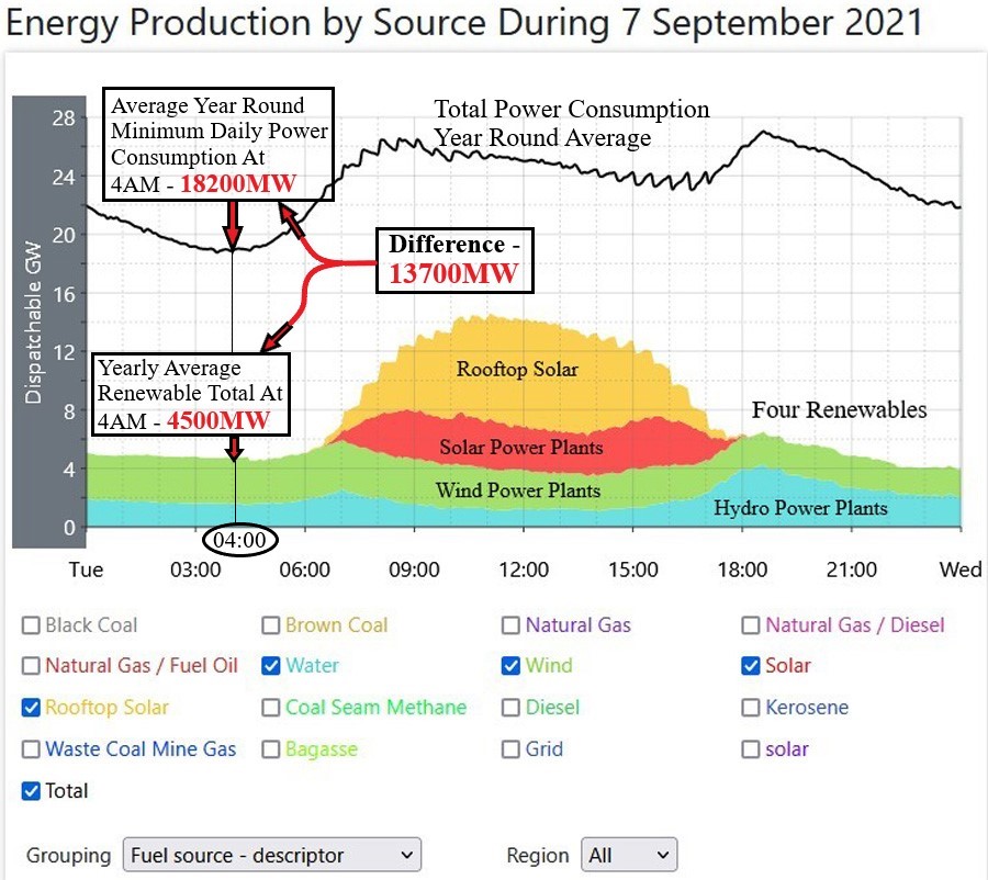
Again, let me stress here that this is not a ‘cherry picked’ day across the year. This is the one day of the year when all the indicators are as close as is possible to those year round averages.
Okay, really, the image ‘says it all’ eh!
4AM is the usual time time of day (well, in reality, the exact time of day) when the total power consumption falls to its lowest point for the day, and again, as I said in the earlier Post, that average is now slowly creeping up, and is currently at 18,200MW, and again consider that, as it’s three quarters of the overall average for daily power consumption. That low point, again, as I mentioned in the earlier Post is lower in Spring and Autumn, and higher in Summer and Winter, and that year round average of 18,000MW has been around that same level for all the fourteen years I have been writing on electrical power matters, so it’s not just a sudden occurrence, as this Base Load is something I have been writing about now right from the start of those fourteen years. So, while nearly everyone is sound asleep tucked up tightly in bed, Australia is consuming all of that huge amount of power.
Okay, now note the contribution of all four of those renewable sources. See the time again, 4AM, and that’s almost two hours BEFORE Sunrise, so there is ZERO contribution from either of those two versions of Solar Power, and that’s something that will never change, either the time, or that zero contribution from solar power. So, all we have left now for renewable sources is the contributions from Wind power and Hydro power, and the year round average at 4AM from both of those sources is just 4500MW.
The difference between the two of them, that Base Load, and the contribution from Renewables is a whopping 13,700MW ….. and that’s at the low point of power consumption for the day.
It’s not a case of, well, we can hope we can get enough, and perhaps lower the consumption.
That Base Load minimum power consumption for the day ….. EVERY DAY of 18,200MW is a cast iron ABSOLUTE. That amount of power is required to be in place without question.
This next image below is probably even more dramatic. This shows that second critical time of every day, the evening Peak of maximum power consumption. Here, the time varies every so slightly on a year round basis, but not by very much at all, and is usually between 6.10PM and 6.50PM, and usually, it is more often than not around that point I have indicated here, 6.35PM, and I also mentioned that in that earlier Post back in Part 4.

This again is that same average day of the year I have used in this Series where all indicators are as close as possible to the year round averages.
And again, the image ‘says it all’ eh!
Here, I had to check every single day of the last year for two things, that total power being consumed at the Peak time, and the contributions from all four of those renewable sources at that same time. Then, after collecting all the data, I then averaged it out, and the figures you see on that graph above are indeed totally accurate for the last year.
The totals for the Evening Peak showed some interest really. You might think that the peaks in Summer would be highest, but that was not the case for a very specific reason, Daylight Saving Time. (DST) Whilst this vast AEMO grid coverage area covers 5 States and one Territory, three of those jurisdictions are quite small power consumers, and make up only 12% of overall power consumption. The Three major States consume 88% of all generated power, and on a (relatively) equal basis. One of those States, Queensland, now the second largest power consumer in the Country, does not have DST, and because of that, the overall evening Peak is now spread out, so while two States have their peak at (their DST time of) 6.35PM, Queensland has its peak at what is effectively an hour later, so the overall Peak is spread out across that hour. The Highest Peak for the year was one huge day in Summer, January 31 2022, when the evening Peak was 33,300MW. Most days of highest evening Peaks are in Winter, and the highest for this Winter was in Early Winter, and this year that was 32,600MW. The average in fact for ALL of the three Months of Winter was only just below that critical 30,000MW, (and that was an average of 29600MW) and there were 37days in Winter when that Peak was higher than that 30,000MW. The lowest Peak for the year was, as is always the case, Christmas Day, and this year those three public holiday days immediately following Christmas Day, when the evening Peaks for those four days were all around 22,000MW, and Christmas Day is far and away the day of lowest power consumption for the year, for any and every year, and that’s hard to imagine in what is basically Mid Summer. The Highest Peak of the year was in fact in Mid Summer, and for reasons I explained back in Part 4 Of the Series, most of those Summer Peaks fall in mid afternoon usually, but those evening Peaks still exist, and that High Peak for the Year was a whopping 36,800MW for that day I mentioned above, and for some perspective, total power consumption on that day was 680GWH, and that was a pretty huge 20% higher than the year round average of 568GWH.
So working out the average for the Peaks for the year, I have that average of 26450MW.
Now look at those renewables, and again, note the time for those evening Peaks 6.35PM. For six Months of the year that is after Sunset, so, similar to the earlier time of 4AM and that Base Load, here we have the case where both versions of solar power are not contributing at all, because it is after Sunset, hence zero power generation. Even during those summer Months and a Month or so either side of Summer, the power generation from both versions of solar power is minimal as The Sun is so low in the sky, and because of that, there is very little power generation at all, even in Mid Summer.
So, again, in the main, we only have the contribution from two of those renewable sources of power generation.
I said that I checked every day of the year for the total contribution from all renewables at that same time of Peak power consumption, and after doing that, I could then work out the average, and that came in at 6854MW.
Here keep in mind that this is at the Peak Power time, and while that contribution from renewables is higher than the earlier Base Load contribution, that Evening Peak is just so much higher.
That difference between the two of them is 19,596MW, and that’s a huge amount of power. Almost 20,000MW.
And again, just like that Base Load in the morning this Peak is also a cast iron ABSOLUTE. And, the same applies here for Peak power consumption, as that amount of power is also required to be in place without question.
*****
So now you can see why for so long now I have been trying to explain why renewable power is so useless. It’s not because I ….. (seemingly) ‘don’t like’ renewable power. It’s not that I seemingly ‘support’ fossil fuels. It’s not that I seemingly ‘prefer’ coal fired power. It’s none of those at all.
It’s just that there are absolutely CRITICAL times in every day when total electrical power absolutely MUST be in place ….. And as I have shown with these last two images, renewable power just CANNOT deliver those amounts of power, and can never be made to deliver those what I have shown to be those absolutely huge amounts of power for when it is MOST NEEDED ….. no matter how much money they throw at it.
Right from the very beginning, all I wanted to show was these last two images, but without careful explanation, these two images on their own, even as self explanatory as they might look, are still quite complex in nature, and require detailed explanation, and THAT is why this has been such a long and involved task.
I only hope I have succeeded in doing that.
Anton Lang uses the screen name of TonyfromOz, and he writes at this site, PA Pundits International on topics related to electrical power generation, from all sources, concentrating mainly on Renewable Power, and how the two most favoured methods of renewable power generation, Wind Power and all versions of Solar Power, fail comprehensively to deliver levels of power required to replace traditional power generation. His Bio is at this link.
OzElecDataImages


Chris Morris
Mon 05/29/2023
Tony
Congratulations on collecting all the data and the analysis. A good job.
The only thing I would add is there are significant losses going from the generation sites to the distribution networks. These are worst when the lines are near rating and heavy interstate flows – Every voltage change is another loss. The load is measured after the unit transformers so they are the excluding generator losses. I haven’t see the Oz figures in any AEMO report but they should be somewhere. As a guestimate, I would say average 4%. The losses go up exponentially with load. The long lines from remote sites would be comparatively worse, especially if they are limited in their VARs control.
There are also losses in the distribution system as well comparable to the transmission figures. The harder you work the system and the further away your power comes from, the bigger the losses.
To give the NZ figures, in 2022 157PJ of electricity generated – 6.3PJ in transmission losses and 5.5 in distribution. You could probably ratio these in absence of actual data.
Chris
LikeLiked by 2 people
TonyfromOz
Tue 05/30/2023
Chris,
sorry, I almost missed this comment, and thanks for the kind words. I was busy here yesterday, and Ed approved this, so I skipped over Comments in my rush.
Sometimes, those line losses are the most difficult thing to explain, and I have tried on numerous occasions.
I have lost count of the occasions like the following, when people who have a little knowledge they may have gleaned from looking at the AEMO dashboard and putting two and two together by what they think they might be seeing. (only to come up with five)
The Queensland Interconnector(s) is delivering power into NSW from the North here in Queensland. Meanwhile in the South, NSW is delivering power via its interconnector into Victoria. Meanwhile, in the West of Victoria, that State is delivering power into South Australia via that State’s interconnector. So, on the surface, it looks like that excess power being generated in Queensland, and is being somehow transported to way off in the far far distance South Australia.
I try to explain that this excess power in Queensland will only be delivered into NORTHERN NSW, closest to the Queensland border, and no further because over distance, there are line losses that end up being quite substantial indeed, as you have explained, and 4% to 5% is accurate.
And therein lies the problem with that vast State of Queensland. Just outside of Rockhampton is the Stanwell coal fired power plant. EVERY other coal fired plant in Queensland (and there are seven more of them, with, including Stanwell, 8149MW of Nameplate) so every one of them lies in that area between Rockhampton and Brisbane. That distance between Rockhampton and Brisbane is 600KM. And then, now look in the other direction. The distance between Rockhampton and Cairns is 1100KM, double that distance to Brisbane. (and there are more places further North and West than Cairns even) So, other than a few minor power plants over that vast area, Stanwell is the furthest North of those large scale power plants. And they want to close down coal fired power plants, and at the same time, increase the population in the North of the State at all those other cities in that area.
In this case two plus two equals five, but only if you have ….. NO IDEA whatsoever about power generation.
Large scale power plants actually can deliver power over long distance, losses notwithstanding, but smaller power plants will cough their last after what is a very short distance.
Last year Australia consumed 208.3TWH of power. to deliver that power with a 4.5% loss rate, that means we had to actually generate 217TWH of power. (give or take)
Losses add up to what is a very substantial amount of power.
Tony.
LikeLiked by 1 person
Chris Morris
Tue 05/30/2023
Tony
You are right that the QLD electrons aren’t going to SA, but because of the voltage changes for interconnectors between the States, the losses are higher than they would be if the generation matched the load in each State. There is a tradeoff between inter-state flow balancing and losses.
Small output power stations can deliver their power very long distance efficiently. Just the capital cost of the line makes it uneconomic. $100MVA line isn’t a tenth of the cost of 1000MVA. And double circuiting isn’t much more expensive.
For maximum efficiency, it would be when the lines are run at their Surge Impedence Loading – this is maybe half their MVA rating. Of course, that is their ideal load from an efficiency, not capital cost point of view.
There is a limit to the length of AC lines can go without intermediate switchyards to control VARs. Maximum is about 1000km, but at 500km, your losses start to mount. One of the reasons to go DC for big distances.
LikeLiked by 2 people
Chris Morris
Wed 05/31/2023
Another thing that does occur is you get circulating currents on the interconnectors between States. For example, power going VIC to SA through Heywood and SA to Vic through the DC.
Their display shows VIC to NSW as one link. In reality it is three, one of which is DC. In overall picture, it doesn’t really matter but the details can make broad assumptions wrong. I’d love to see the flow Buronga to Red Cliffs shown, especially with the new line going Buronga to SA. That will be interesting for grid management.
But overall, I still believe swapping coal for the unreliables will cost Australians dearly.
LikeLiked by 2 people
Johnno
Sat 09/03/2022
Thanks for this. When I see raw numbers my eyes start to glaze over, but charts are good.
Some questions and comments:
In the second chart/table, what is the default sort order and why that one?
In the chart “Energy Production by Source 7 September 2021” the striking feature is the contribution of solar during daytime hours. The chart tells a story.
The colour coding on the legend is a problem for someone who is red/green colour blind. The colours for Water, Coal Seam Methane, Wind and Diesel all appear very similar.
LikeLiked by 2 people
TonyfromOz
Sat 09/03/2022
Thanks for this comment Johnno,
and it might seem (to me, anyway) like this could have been a good idea to do it like this.
The sort order is, well, one that could mean anything. However, the site that actually does this leans to the side that favours all versions of renewable power, so my ‘guess’ is that they like to see those renewables at the top of any chart, and the fossil fuel sources as also ran sources towards the bottom.
The graph/chart you mention shows all those sources and here there might seem to be some reason to do it like this. The largest contributors black coal, and then brown coal are at the bottom, as they make up the largest contributors, and the others are added to that. In a way, it sort of gives a false impression as to how much they all actually do contribute, hence both versions of solar look like they contribute quite a lot, and that may not be the real truth of the matter, as I will explain as I get further into it all.
With respect to the colour coding of sources, I have no control over that at all, I’m sorry.
Tony.
LikeLiked by 2 people
whatyareckon
Fri 09/02/2022
Reblogged this on whatyareckon and commented:
Phew, glad I have Tony to help me understand this!
LikeLiked by 2 people
TonyfromOz
Fri 09/02/2022
whatyareckon,
thanks for this comment in response, and this is the perfect opportunity for me to ask.
Does something like this ….. ‘really’ help you understand it?
I’ve struggled with this for so long.
All of my electrical trade training was just short of a degree in electrical engineering.
Now, decades later, I know all of it as second nature.
However, I remember that as I was going through that learning process myself, I found it difficult to understand myself, and I was not alone on that front, as all of us who were undergoing that electrical education found it difficult to understand.
And therein lies the very root of the problem.
How easy is that, I turn this switch and the power comes ‘out of the hole in the wall’ ….. so to speak. And it does it every time, and you don’t even think about it.
So how can we even begin to think that people ….. ‘can’ understand it.
People believe what they are told, because they expect to be told the unvarnished truth of it all, and when that so called ‘truth’ is ‘spun’ in technical jargon that is virtually unintelligible, and with nowhere to check, even if you could understand it, then they can virtually get away with saying whatever they want to say, because they know that no one will pick them up on it.
That’s my place in all of this. To try and explain it so that people ‘can’ see the ‘real’ truth behind what you are being told.
For so long now, because I do all of this, I have struggled to try and make it as easy as I can for that average person to understand, and this is just my most recent attempt at doing that.
You could respond with a further comment telling me if what I am doing here really is understandable.
Tony.
LikeLiked by 3 people
whatyareckon
Sat 09/03/2022
I have to say I am like what you said you once were and that is I am glad the wall socket provides the power I need. I really do appreciate those who were pioneers in the field of electricity such as Michael Faraday and that you are following in their steps. Thank you and keep up your good work.
LikeLiked by 2 people